Wednesday, March 9, 2011

Just Add Salt

Last time on Unlucky Punk....

Monsters reemerged, TJ was redesigned, A Super Fighting Robot Guy changed the layout and Faux Captain Marvel struck a killer pose.  Which leads us to this week's episode. New characters dominate the line up.  Let's get into it!
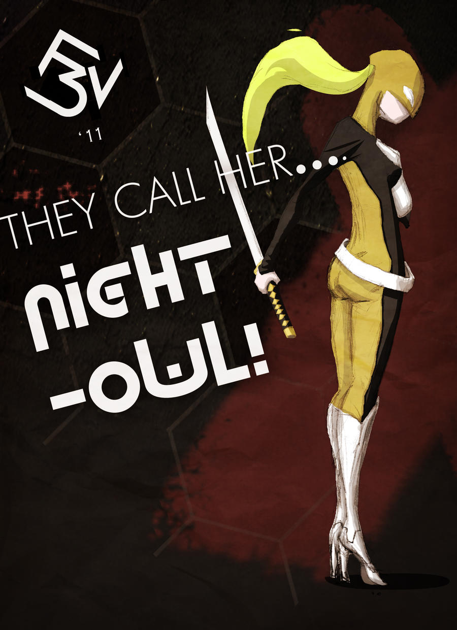


As the text suggests, the character's name is Night Owl, a volatile vixen, who's more than handy with a katana.  Trained from a young age to become a cold, calculating assassin for a mysterious Agency, bent on world domination (... or something), she parades around in the night felling all who stand in her way.She's yet another character I drew during my "4 drawings a day" era (ahh. What a time that was....).  As I have said on numerous occasions, I didn't draw these characters for any particular purpose.  Just for the sake of honing those skills and building up a my mental library. It's just that sometimes during the colouring process one's mind cannot help but wander off and invent a small backstory in the process.  Speaking of process, this pic's layout took a hell of a long time! A lot of the elements on the page were deceptively difficult (I think I may just make alliteration my new thing... Coupled with parentheses, I'd be unstoppable!) to balance.  I can only hope what I've presented is a halfway decent result.
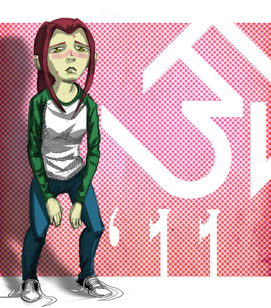


This was an incredibly enjoyable picture to do, despite it taking longer than what it's simplicity suggests. I almost discarded the image for all it's anatomical inaccuracies, but I ultimately decided against it, and used this image as an opportunity to experiment (I don't know if I've already said this, but not every one of those 4-A-Day characters were gold.  There was some careless and cringeworthy work in there, as well. So I've decided to simply pick out only the decent stuff to work on from now on). I toyed around with so many Photoshop tools that I normally wouldn't touch, just to get familiar.  Overall, a very fruitful learning experience.
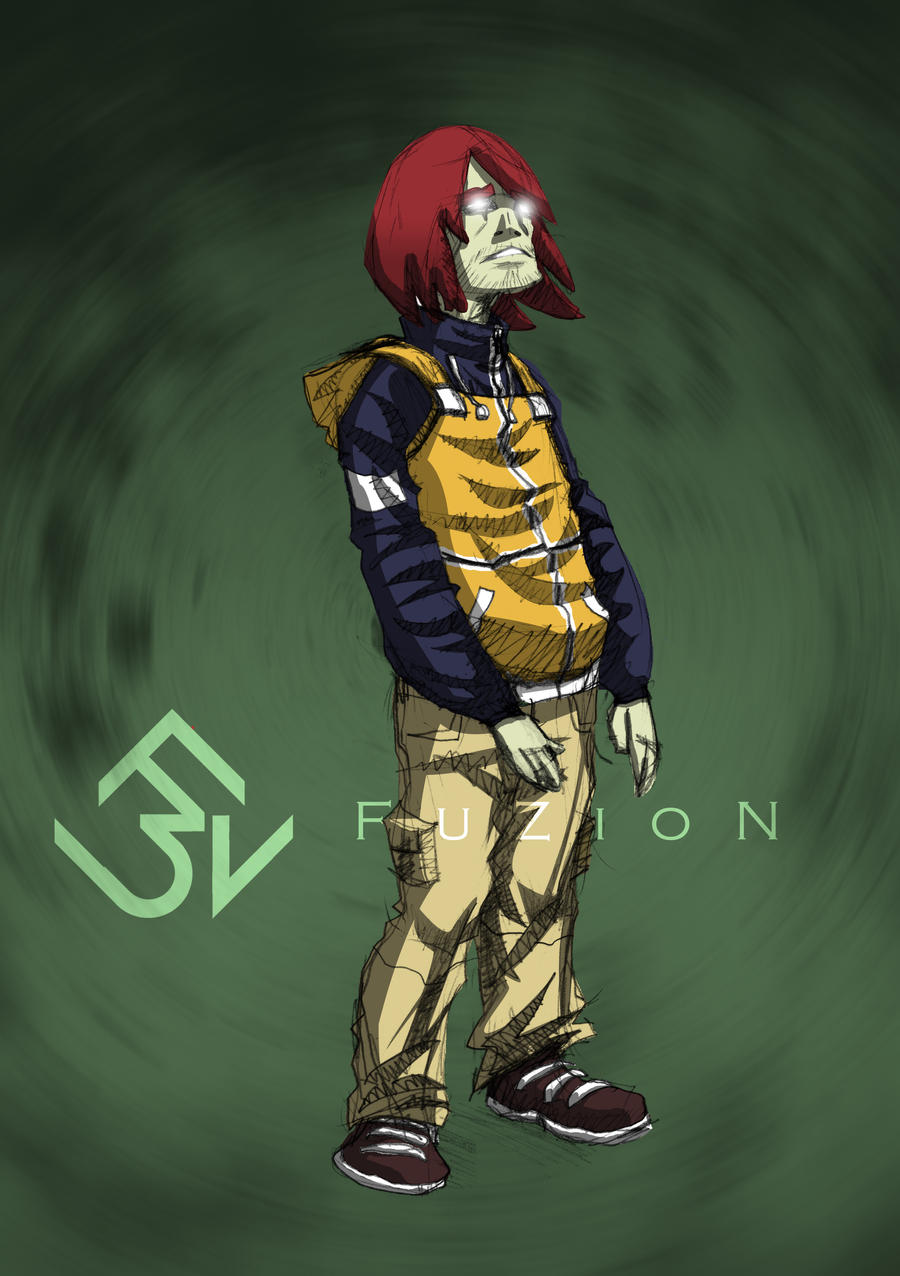


And then we get this guy.  There's a funny story behind this image. This was so weird 'cause halfway through colouring this, the dude ended up looking like Ronald McDonald! I just couldn't shake the association! What a struggle it was to stop myself thinking of him as a gangster Ronald McDonald!  I didn't want to change the colour scheme cause I really liked the colours. After hours of tweaking the hues, I think I've managed to sidestep a potential disaster (although I've probably just ruined it for you by mentioning this).
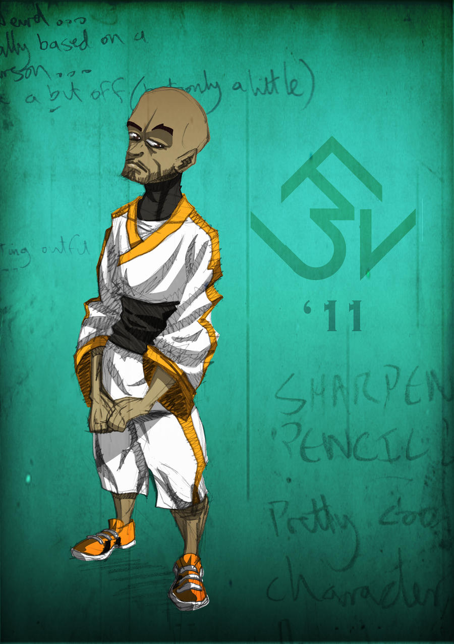

 I don't really have anything noteworthy to say about him.  I really like the design, though.  I've recently had the idea of pitting some of  my favourite characters against each other, and doing a series of battle stills.  This guy (along with Faux Marvel) would definitely be at the top of the list.
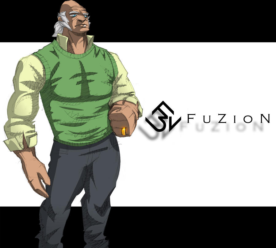


Y'know, character associations are a dangerous thing(I'm not really sure if that's the appropriate term or wording, but by character association, I mean if one character reminds you of another, for some or other reason). The other day I showed this to a friend of mine and he instantly thought the character looked like a buff Robert Freeman from Boondocks.  Ever since then, I can't see anything else, even though the colour scheme was rather arbitrarily chosen.  I originally envisioned this old as a sort of King Pin-type figure who owned a chain of notorious nightclubs... Well. There goes that image!

And that concludes this week's episode.  I'd like to mention that entry was particularly jam-packed so I could conclude the Character Design Saga and focus on other more challenging pictures (perhaps "conclude" is a bit... final.  I'll still be doing the designs, just not as intensively as I've been doing as of late).  Next time, a familiar character makes a special guest appearance and a legendary street fighter joins the line up.  Ooooh! this is getting so good!

Thursday, March 3, 2011

Lazarus Has Risen...

Y'know, I think Lararus was in on it with Jesus.  And it was all  probably some sort of a routine they took on the road.  I mean, if Jesus was a flim-flam it would explain a hell of a lot!  The entourage, the whole water-to wine-thing...  Wait. Why am I here again? Oh. That's right. It's time for yet another installment of my art prattle. Let's get straight into it, before I go off topic again. (That's the last time I open with an obscure biblical reference... So difficult to segue into art from that!)

Starting with:

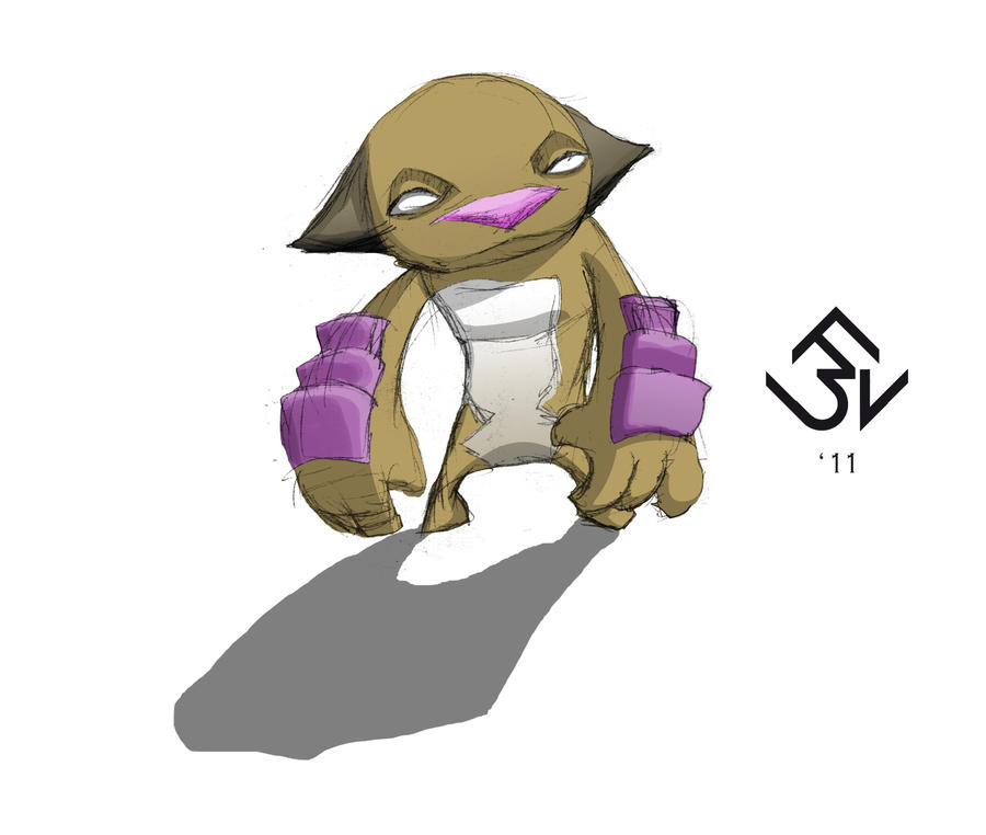
I did a bunch of these after I got tired of drawing all those people.  I'd almost forgotten about my penchant for little monster-thingies.  Sometimes you gotta slow down on some of the more "serious stuff" (I put that between quotation marks because strictly speaking, none of it is really serious, but y'know...) and do a lil' doodling.  Besides: monsters are huge and integral element of the FuZioN Universe.  It's a fairly good time to get back in the swing of designing dem' critters...

Speaking of FuZioN...


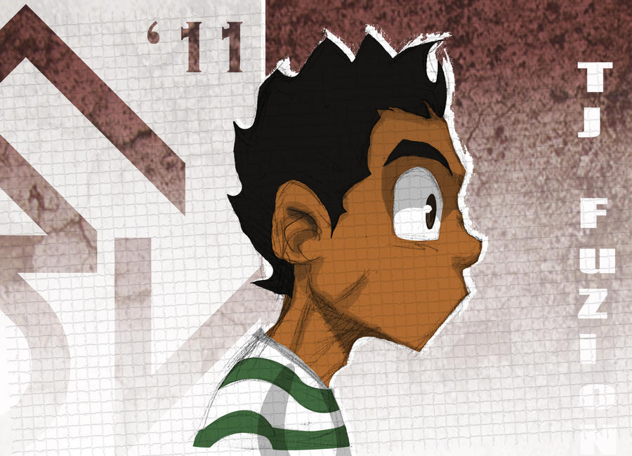
"Yeah! It's ya Boi!" (What did we say bout those Jigga quotes!?)  This came about when I realised that I hadn't really done the "new TJ" in profile.  So, after a coupla drafts, this is the result.  Additionally, I should mention that I adjusted his colour palette a bit.  His skin colour was slightly off (Too much caramel, not enough coffee) and, since there are other non-white characters with different ethnicities to TJ, I had to diminish the confusion of identifying who was what a bit more than I had before (not that that sort of thing matters, but if it's part of the character's identity, then the diversity has to be apparent.  I mean, ideally I'd draw an all-beige cast to try and keep racial profiling to a minimum... not that all audiences are racist, but we're all prone to our own prejudices and... Oh my god, this hole just keeps getting deeper!). 

As you may have noticed, I switched it up a bit with the backgrounds on that last image. I got bored with my usual layout and thought it was time for a little more experimentation.  Which resulted in the image above and...


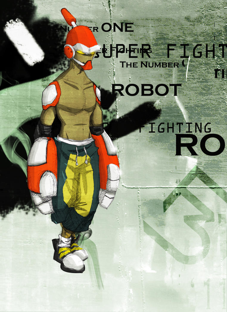
Super Fighting Robot Guy!  That may or may not be his actual name, but it's all that came to me at the time.  As I have said before, I absolutely detest design, but I have a lot of respect for those who practise the art (do you "practise" design?  Not sure. Sounds appropriate...).  Bringing order and efficiency to chaos... In a visually pleasing manner... Not an easy thing to do.  However, I can't ignore the fact that I spent the better part of THREE YEARS learning the principles (I didn't get that far though, due to my extreme hatred for it) and so I took a crack at integrating it a little into some of my art (it would also be a good exercise in improving my Photoshop skills).  Hopefully, I haven't spat in the face of all muh designer pals with this little travesty I cooked up.

To my surprise, I enjoyed this a little bit more than I expected. So much so, in fact, that I did it again.


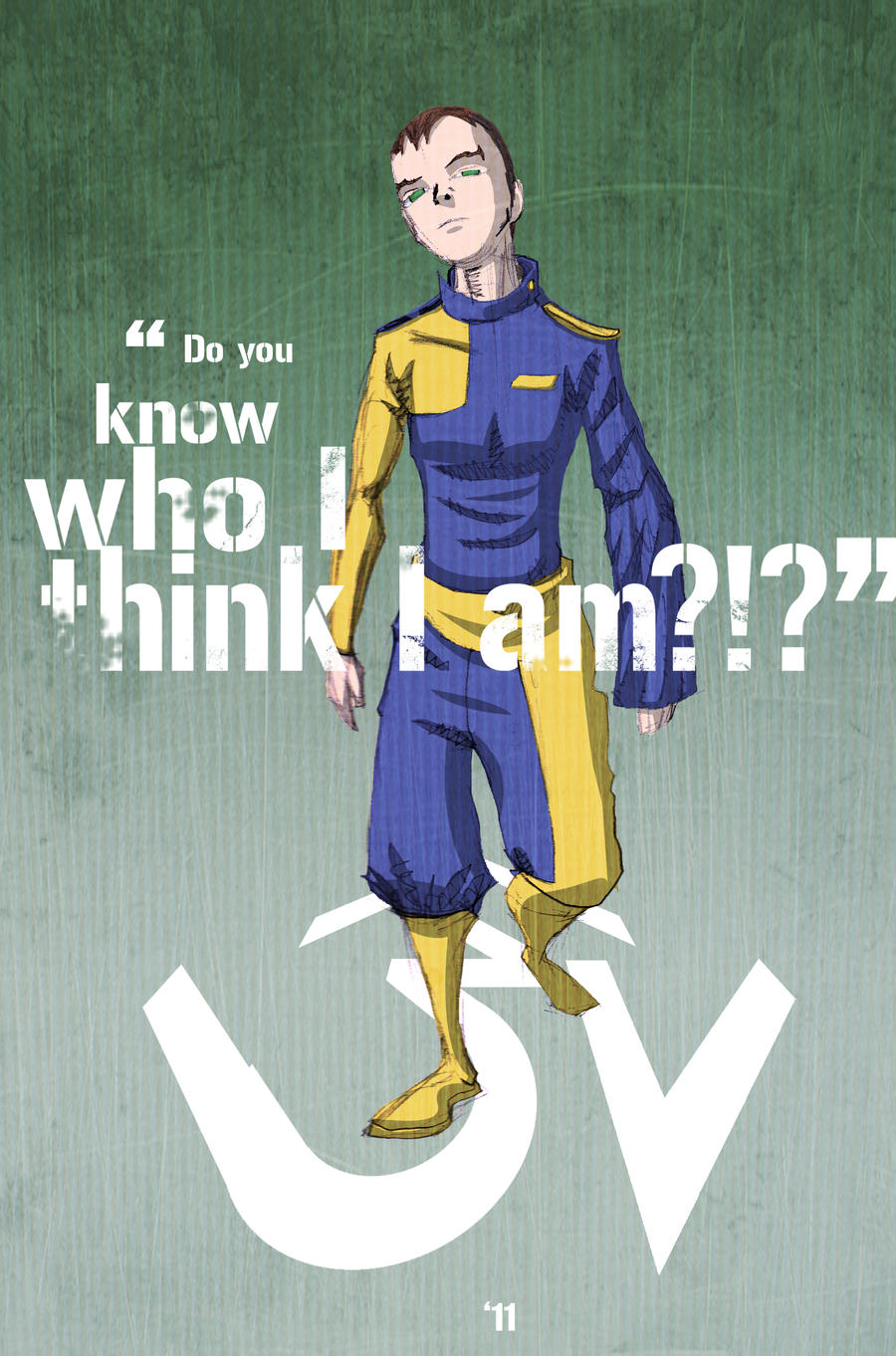
I almost didn't colour this image as I noticed that I made quite a few rookie mistakes when pencilling this- mainly in terms of anatomical correctness and cloth physics- but there was just something about that pose! That arrogance; that swagger (the actual definition of the word)! So dynamic! And the colours were so clear in my head. It had to be done. Also, I don't know don't know why, but this character reminds me so much of Captain Marvel (the DC/ Shazam one, not the bullsh*t  Captain Mar-Vell from Marvel that no one's ever heard of and who's name Marvel won't f#king give up, preventing us from ever seeing Captain Marvel in his own self-titled series or a Captain Marvel movie!), even though the costume or the colours don't even closely resemble those of Earth's Mightiest Mortal. Must be some subliminal thing...

And that's it for now.  I'll be back real soon with more madness.  QUEUE THE CREDITS! (I've really got to come up with a more organic way of concluding these posts!)

Wednesday, February 23, 2011

"Watchu Want Me to Do?! I'm Sorry!"

So. Yeah... I'm back on muh grizzle.  I've actually been quite busy over this little hiatus, creating some self-proclaimed works of art.  I've got some old, some new and all FuZioN. So without further ado...

First let's get the old out the way.  I don't know how I missed uploading this one earlier, but:

Yeah this is one of the last character designs I completed in 2010, before I was engulfed by all that FuZioN madness.  It's been so long I honestly can't remember anything noteworthy or even any remotely humerous anecdotes about it!  I know I did have a bit of trouble with the colour scheme (quite honestly, I'm still slightly peturbed by it).  It, along with a slew of other images, forms part of collective that chronicle my quest to conquer purple!  SO frustrating, that colour...

And now for something a little more adventurous:


Yeah boi!  A personal best, methinks. It took longer than I can even remember, but so worth it.  I was initially absolutely daunted by the notion of such an undertaking (as this is my first fully coloured environment, not only on Photoshop, but EVER!), but about halfway into it it seemed more and more and more like something doable.  A lot of Burn and Dodge Tool usage on this one... More than I ever thought I'd ever thought I'd use and I gotta say:  Their kinda awesome!  And now I love the Burn and Dodge tools! I can't get enough of them!  You can't pay enough to stop! (Well you probably could but... Woah. Deja Vu!)  I can't really get into the specifics of it right now (because as you well know, the TJ FuZioN storyline is a highly sought after secret), but this image, as random as it initially was(I just wanted to draw TJ doing something dope), marked the turning point in the construction of the FuZioN Universe and inspired an idea so cool I dare not speak of it until you can buy the 2nd volume of TJ FuZioN IN STORES! That's right! You read correctly!

Now that I've got that out the way, (Who knew art could breed such narcissism?) it's on to the next one (that's one too many Jay-Z references):


This picture is, without a doubt, completely random.  I don't know what it is that TJ is looking for through all those papers or why that perspective-bending sign is there, so don't ask.  I actually drew this before the above image (hence, a less complete environment) but I completed the other one first and so here we are. I really enjoy drawing TJ and Strike doing stuff together but I never know what to make them do! And this is the result, I guess. I should also mention that I've recently made a conscious decision to include a lot more texures and overlays to my work (as I have done in this image).  I've mostly only been using them on backgrounds and  "screens", but I'd like to eventually get around to using them on items and environments more...

Aaaaand I think here's a good place to stop.  I'm sorry but, I think this is plenty to get through for now.  Rest assured, I could go on for double this amount and still have images to spare, but I'd like to pace myself... and my hands are tired (it's that carpal tunnel settling in)!  I'm still on the hunt for a reliable A3 scanner (If anyone has a hook up, please do let me know), but don't think that'll deter me from getting all this slghtly-above-averageness to you.  For now, I'm out. Hope ya'll enjoyed. 


Wednesday, January 5, 2011

That Ol' School Meets the Nu School

In an effort to grasp at some semblence of a social life and become a functioning member of society, I've slowed down on muh drawing for now.  Luckily, I'm far behind enough on my posts to give you at least one more bountiful helping of delicious eye candy before a small drought.

I remember mentioning sometime ago that I was feeling that FuZioN fever hitting me again and that I would possibly venture back into the TJ FuZioN Universe soon. Well, it's finally happened and today I present to you the New TJ FuZioN!:

Just don't ask me why he looks so surprised

Well, maybe that was a bit of an exaggeration. It's more like a slight redesign of the old TJ.  In fact, I decided while I was drawing that If my job was done right, then it shouldn't look like I did anything to him at all!  I just recently realised that there are a quite a few adjustments to make when converting a character who's existed in black and white for so long into colour.  Especially when it comes to my drawing style! Certain things just don't translate very well.  Gone is the half-drawn grin thing  that I liked so much (I know he's not grinning in this picture, but I just wanted to give an example of the sort of things that were considered during the process) as are the random "gaps" I left in his hair.  There's also a more conscious consideration for shadows overall, which is where I think the most notable change comes from. I never used to shade his nose at all and it was a surprisingly long process to try and get it to look just right... and I still don't think I'm quite there yet!


While drawing these pics is the main focus of this entry, I also have another surprise.  During the FuZion redesign I decided (on a whim) that a new signature/logo was needed for 2011.  The old one was kind of random and a bit of a rip-off(which I openly admitted before!), so I worked on something a tad more original:


 It's still random as hell, but at least it's all me! No. I didn't go through the "proper design" channels, so yeah it's somewhat unbalanced. Yes.  The tail of the "Z" not 100% smooth. But you know what? I DON'T CARE. I like it. So there! Anyway, back to TJ:  ...Actually, I think I've mostly said everything I could about the redesign... Except maybe I should mention that I didn't follow my usual MO when redesigning TJ(I guess I'm just a rebel like that) since I felt I already knew the character well enough to just wing it.  Weird how it worked out almost exactly how I wanted it to...


The rest of these are just me playing around with different expressions and "face poses".  I ended up adding a slight gradient on TJ's skin in an attempt to make his overall appearance more... 3-Dimensional. It's fairly subtle, but I think he ends up looking so much rounder and... bouncier. (always with the overwhelming vocabulary!)


This was just me messing around with overlays and textures. Just to make all this fairly simple mugshot that much more interesting.


And of course, I couldn't leave out the adorable Strike.  Even though he's gone through a bigger change than TJ, all I basically did to him was make him fatter and more... defined, I suppose, along with the addition of the bare belly, which he never used to have. (how could I have left that out the first time?!)  Y'know, what's actually quite amusing, is the amount people who were surprised that he was red. What other colour could he have been?!

I still have a long way to go before I'll be comfortable with starting the TJ FuZioN comics again.  Not only are the characters going through a stylistic revamp, but the whole universe is getting a makeover. It's still gonna have a lot of the whimsical, offbeat humour(more like, attempt at humour) and the pubescent awkwardness that was so prevalent in the comics I did in high school, except, this time they'll also be a lot more at stake. This time there'll be real consequences! This time it's for realz.

Monday, December 27, 2010

Better Than Never

"Who's the dude writing blogs with so much emphasis?
Dirty Harry!
Who most liberally makes use of parenthesis?
Dirty Harry!"

Wow. I haven't posted in a mad minute!  So long I felt I needed a little theme song to usher me back in...Truth is, I ran out of cap like a day after I promised the pencil updates!  That's what you get when your eyes are bigger than your stomach... or in this case data bundle, I suppose.

Anyway I got a lot to get through so let's get into it before the analogies get any more painful:


I originally intended this guy to be a Spanish swordsman (hence the curly hair and the SWORD), but then that hat happened, and he was from then on dubbed the Creepy Magician. It kinda works, methinks.  Yes, I did another same-picture-but-with-variations thing, except this time I thought the variations could be a little more exploratory than a f*king line! Don't get me wrong, I love the line,but it's time to move on to bigger, better and more colourful things now... Hopefully those magic dust balls (or whatever) didn't completely ruin the picture... I seriouslsy worked hard on them... Sort of...


Next we have the super badass Blue Dude! I don't know what it is, but there's something about red sneakers... Anyway, I tried to give the character a little bit more of a dynamic pose than the previous one because... well because i got bored! But I learned that it doesn't always work as I find it's better to familiarise yourself with a character first before diving into poses. This image marks the first drawing where I was at ease around the gradient tool, so much so that In used it on EVERYTHING! And now I love using gradients! You can't pay me enough to stop using them (Well you probably could, but I think you get what I'm shaying (sic))!  Also, I started playing around with filters a bit. You can't really tell right away, but if you where to look closer you'll notice I used a canvas filter on it, with the intension of adding a little more depth and tightness to the image. Hopefully you can pick up a little of that in there...


And this would be a... zombie... Pirate-clown...?? I dunno! But I do know that it's probably my favourite pic so far.  I find I'm finally settling into a colouring style that I'm comfortable with.  Speaking of colouring, though, is it just me , or is purple quite a difficult colour to compliment.  By that, I mean that there's relatively very little you can do with it.  Sure, there's yellow (complementary colour. subtle difference), and green and orange kinda work sometimes, but overall it feels very restricting to me as everything I end up colouring  with purple as a key colour inevitably ends up reminding me of the Joker or the Green Goblin! Ironically, my frustration  hasn't prevented me from using it so often (perhaps I use it because it's so restricting, instead of in spite of the fact, in an effort to conquer it).


Lastly (No! Say it ain't so!), I have this unremarkable hulk.  Y'know, I really wanted to colour all these characters in chronological order, but due to all sorts of scanner mishaps (I don't care how desperate I get, there's no way I'm paying R5 a scan!), different sketchbooks were sent at different times and so now I just colour the ones I'm in the mood for. Hopefully, there isn't too big a gap in quality between the older and newer sketches. I know I cut a few corners in the beginning as I was settling into a style.  At any rate, about the image: As I said before I've gotten quite comfortable with muh colouring(justifiably so, I hope). And with comfort comes an ease in exploration (at least, that's the case with me).  As a result, a lot of the shadows and cloth folds were added in Photoshop, something I wouldn't have been comfortable with doing a few weeks ago. It's not exactly a gravity-defying leap, but... Progress. Yay.

Anyway, since I originally intended this to be a Christmas special, or whatever (I obviously missed that deadline!), I thought I should  at least attempt to tie some sort of festive message in at the end. So to anyone  who still reads this blog, thank you for sticking with it, I hope ya'll enjoyed it so far 'cause there's plenty more to come (in the near-ish  future) and I hope you had a Merry Christmas... There. That wasn't at all contrived.

Wednesday, December 8, 2010

Obsessed

I swear I'm not a Survivor fan!  But there's something about that Brenda, I tell you! Or rather there was something bout her, since she got voted out two weeks ago (at least Marty got the boot before her). Not so surprisingly, though, I haven't been nearly as enthusiastic about keeping up with the show since then(and by that I mean I haven't at all been enthusiastic about keeping up with the show since then!)...

However, breaking my Survivor fever did remind me that I was behind on posting all those those Mini Portraits I did of her (and a couple of other cast members) a while back, and so here we are:

At least she went out like the boss she is! No grovelling for this Queen Bee...
Drawing sill don't do her no justice!

This was a quick sketch I did from a still of the lovely Miss Lowe (How is a woman that fine still single??), sporting her trademark lower lip-licking face.  I actually drew this out of my frustration over not  being able to accurately capture her features while keeping her looking cartoony (Yeah I've become quite obsessed with nailing her... Her likeness, that is!), so instead I went in almost the complete opposite direction! Go figure. I tried to keep the colouring as basic as possible to try and bring that cartoony element back in. Maybe I should add a few more "facets" to it just to see where I can take it... Watch this space for more Brenda!

Next we have Naonka:
Never a dull moment with her. From kicking over disabled people ("Screw yo' leg!") to flippin' da bird at Tribal Council, Nay KEEPS IT REAL (and gets her ass voted out)!  I just cracked up so hard at this "Say wha-??" look she pulls so often that I had to do a drawing of her! Ironically, even though I drew this almost thoughtlessly, during the colouring process it became one of the closest examples of the style I've been trying to achieve. Hope the attitude's all there...

And Unfortunately that's all I got for now!  It's not much... but it's December goddamnit! Also, I'm out sketchbooks for now, so the character drawing thing is on hold for a while.  But at  112+ characters drawn, I think I can find a somewhat productive way to fill up all that free time (Clue: It rhymes with Shmotoshop). Now,can somebody point me in the direction of a goddamn scanner THAT WORKS! 

Thursday, December 2, 2010

A Certain Romance

Where is the love?? I seem to have been gone for a minute and I've been awfully cold towards my dear blog, but now I'm back.  Evidently.  And I'll have you know that my time hasn't been spent idly. (Is that correct English? I'm not sure! Good thing I'm not getting graded  on this, I suppose!) No, sir.

I have recently committed muhself (finally!) to drawing at least 4 characters a day. I know that doesn't seem like much but lemme tell you: 3 weeks and (84 drawings) later, the demands for consistency (the magic word here) and variations that come with this task start to seem more absurd by the minute!  And these are just pencils I'm talkin'bout! I'v only recently began to factor in Photoshop time! Now I'm not complaining. (who would I even complain to? I brought this on myself!) I'm just painting the whole picture so the irregularity of my posts seem a lot more reasonable... I'd like to think that's a perfectly acceptable thing to do.

So what do I have to present this time (other than mouthful of whining)?  Just these:


Well, not just these.  I've still got more! But I'd like to say a few words first. Firstly, I didn't post the same picture twice. If you look closely you'll notice the second one has a distinct white... shadow-line... thing. I couldn't decide if the picture looked better with or without it so... I know it's a very subtle difference. But I guess I'm just indecisive like that. Secondly, I should say that I've started Photoshopping (seriously, WTF?) straight from my pencils, as opposed to to tracing them on Illustrator first.  I'm still planning on using Illustrator for some of my more simplistic stuff but I feel like a lot of the personality and life of the image is lost when you vectorise drawings like these...and it takes way too F*%KING LONG!

Then we have these:


Once again, I have slight variations of the same thing.  This time though I happened to stumble into (onto?) the variation when I accidentally deleted my pencil lines. I thought it looked cool anyway so, why not show both?

Aaaand:


Yeah. the white-line-shadow thing again. And no. This wasn't even remotely inspired by Rihanna's new do!  Now. I should probably mention that none of these characters have anything  to do with anything. They're not for a story and they're not somehow related. Other than through the fact that they were all drawn by me. All this character design merely serves the purpose of honing them grossly underdeveloped skills of mine.

Not to get all sentimental (which is exactly what people who say that sort of thing end up doing! ), but recently, I've come to realise that I've been treating this art thing like far too much of a burden.  It's weird that  these 3 weeks of drawing have let me appreciate the concept of working hard at something and getting better at it because it's something you want to do and not just because some f*king curriculum requires it! I'd almost completely forgotten  how much I love this sh%t!  It's truly an exciting time to be doing what you love. And everyone should get to do that.  After all: If there ain't no romance,  then why bother?

From now on I'll try to post the pictures as I complete them so it's not all at once like this and over long intervals. And maybe, if the internet cap allows  for it (not everyone has an unlimited ADSL line!), I'll post the pencil scans at the end of every week  so the blog doesn't get stale. I gotta keep all 5 of you loyal fans entertained.  As for now : Giggidy! Giggidy! That's all folks!