Wednesday, March 9, 2011

Just Add Salt

Last time on Unlucky Punk....

Monsters reemerged, TJ was redesigned, A Super Fighting Robot Guy changed the layout and Faux Captain Marvel struck a killer pose.  Which leads us to this week's episode. New characters dominate the line up.  Let's get into it!


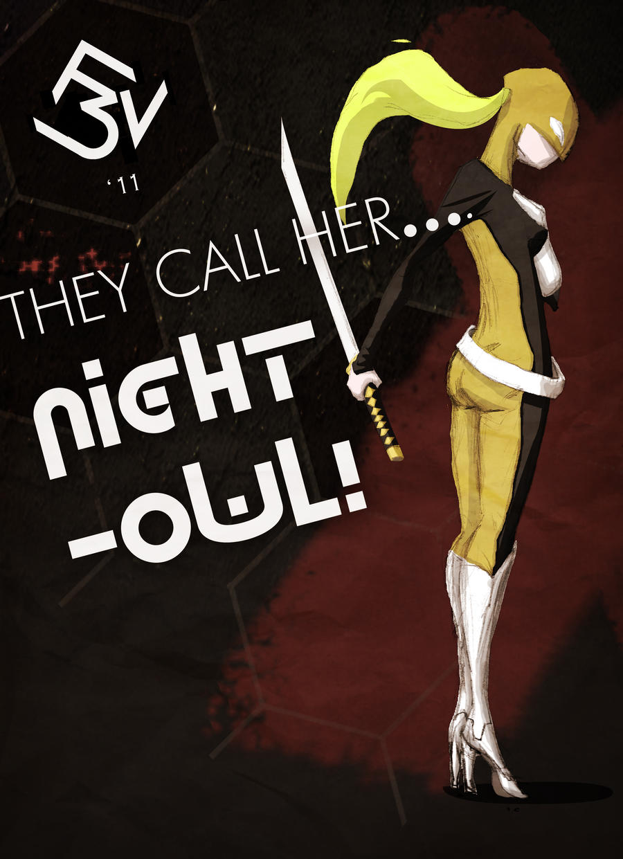
As the text suggests, the character's name is Night Owl, a volatile vixen, who's more than handy with a katana.  Trained from a young age to become a cold, calculating assassin for a mysterious Agency, bent on world domination (... or something), she parades around in the night felling all who stand in her way.She's yet another character I drew during my "4 drawings a day" era (ahh. What a time that was....).  As I have said on numerous occasions, I didn't draw these characters for any particular purpose.  Just for the sake of honing those skills and building up a my mental library. It's just that sometimes during the colouring process one's mind cannot help but wander off and invent a small backstory in the process.  Speaking of process, this pic's layout took a hell of a long time! A lot of the elements on the page were deceptively difficult (I think I may just make alliteration my new thing... Coupled with parentheses, I'd be unstoppable!) to balance.  I can only hope what I've presented is a halfway decent result.


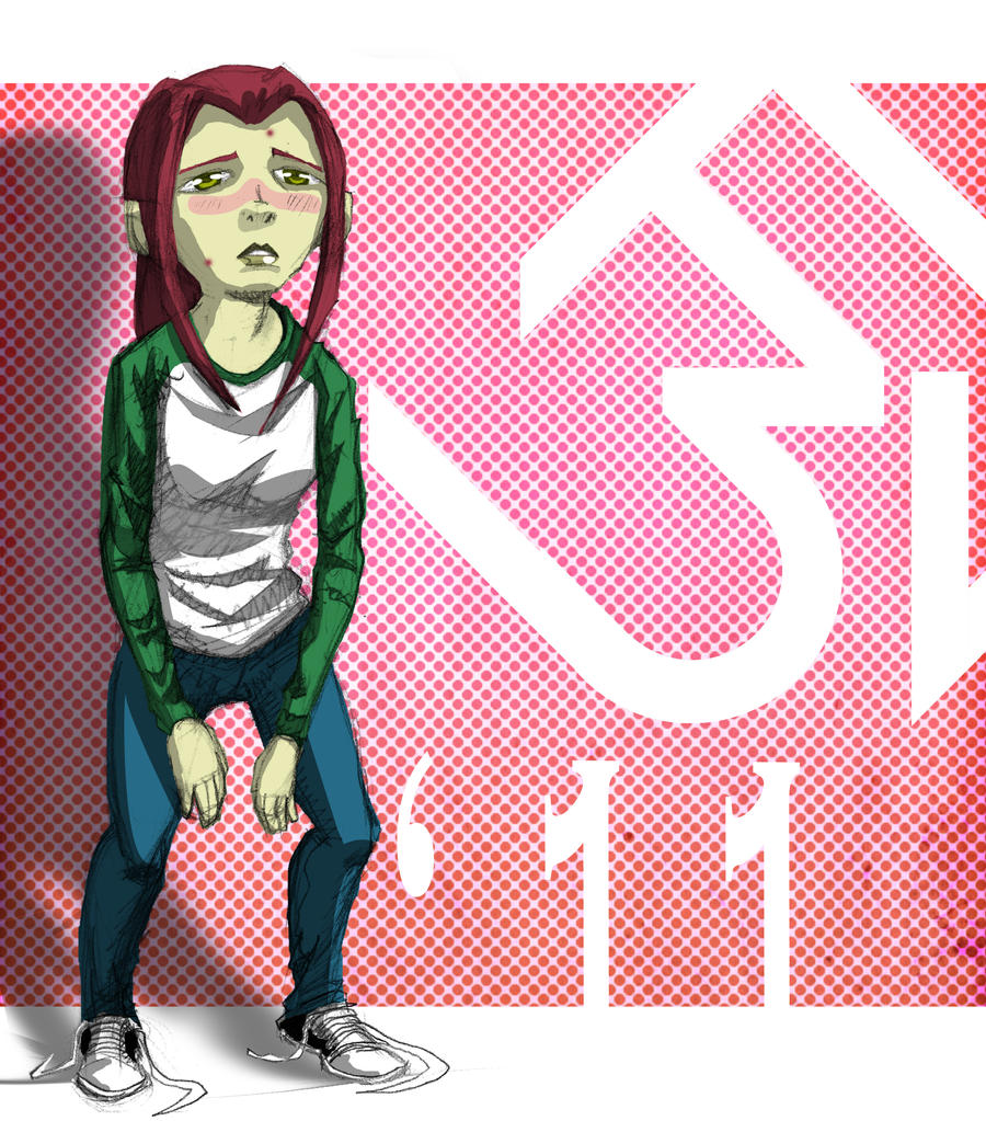
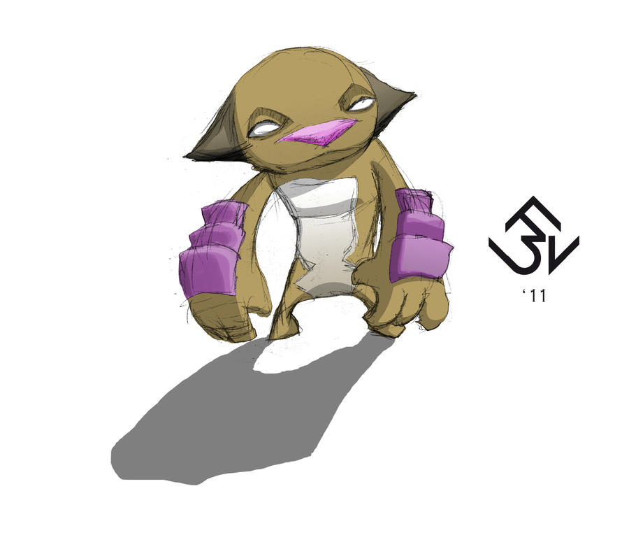
This was an incredibly enjoyable picture to do, despite it taking longer than what it's simplicity suggests. I almost discarded the image for all it's anatomical inaccuracies, but I ultimately decided against it, and used this image as an opportunity to experiment (I don't know if I've already said this, but not every one of those 4-A-Day characters were gold.  There was some careless and cringeworthy work in there, as well. So I've decided to simply pick out only the decent stuff to work on from now on). I toyed around with so many Photoshop tools that I normally wouldn't touch, just to get familiar.  Overall, a very fruitful learning experience.


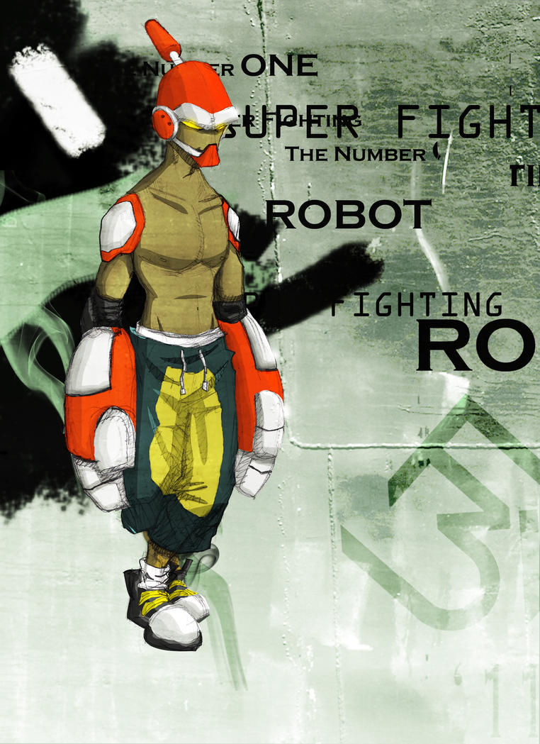
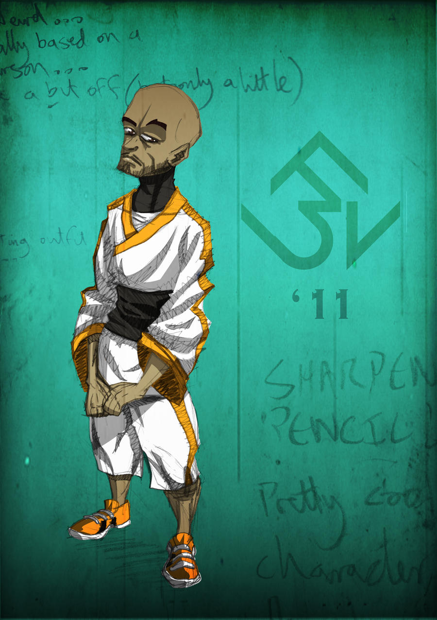
And then we get this guy.  There's a funny story behind this image. This was so weird 'cause halfway through colouring this, the dude ended up looking like Ronald McDonald! I just couldn't shake the association! What a struggle it was to stop myself thinking of him as a gangster Ronald McDonald!  I didn't want to change the colour scheme cause I really liked the colours. After hours of tweaking the hues, I think I've managed to sidestep a potential disaster (although I've probably just ruined it for you by mentioning this).


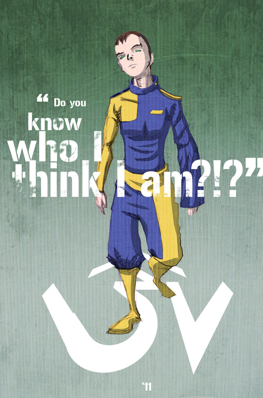
 I don't really have anything noteworthy to say about him.  I really like the design, though.  I've recently had the idea of pitting some of  my favourite characters against each other, and doing a series of battle stills.  This guy (along with Faux Marvel) would definitely be at the top of the list.


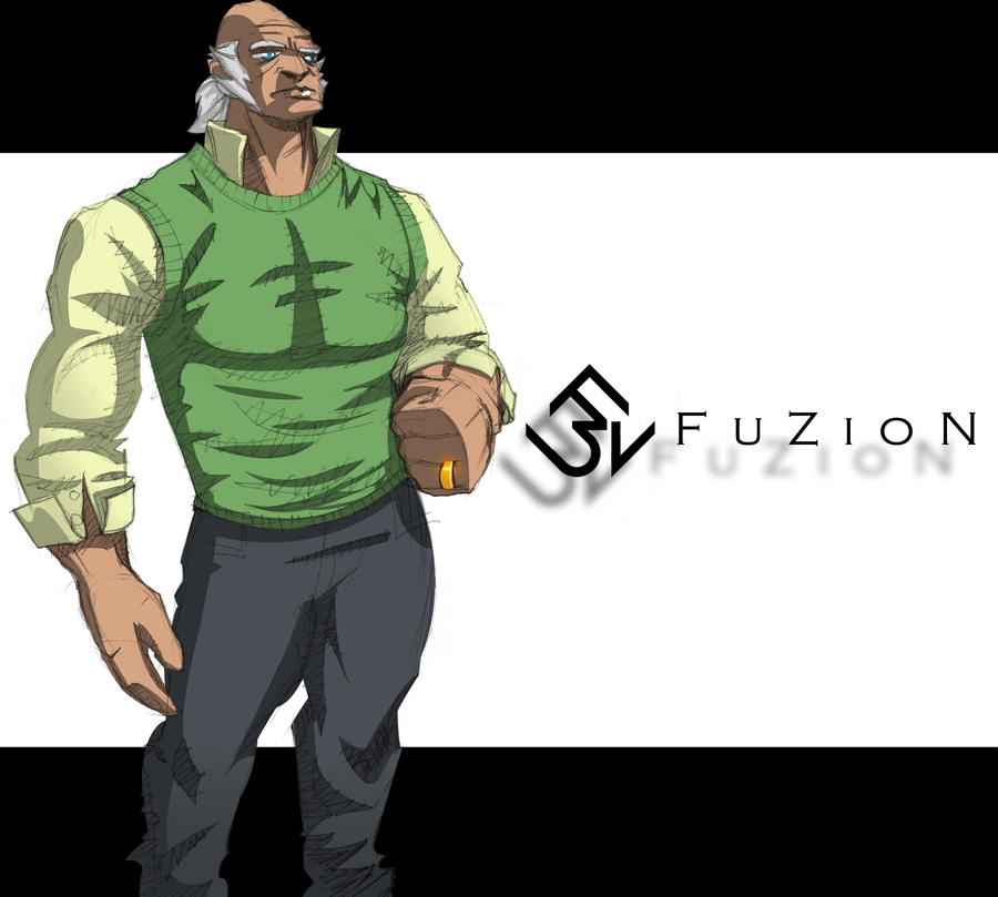
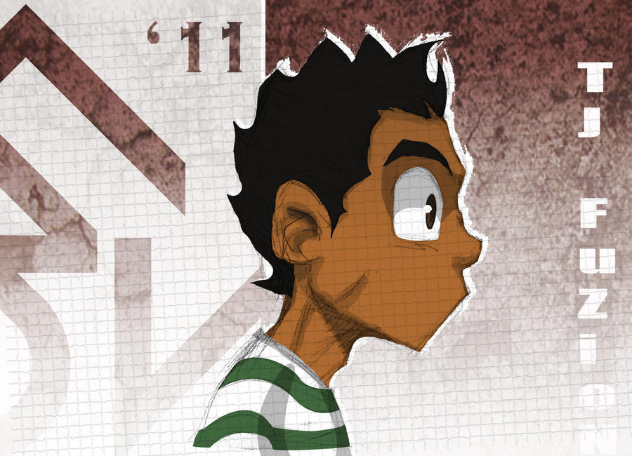
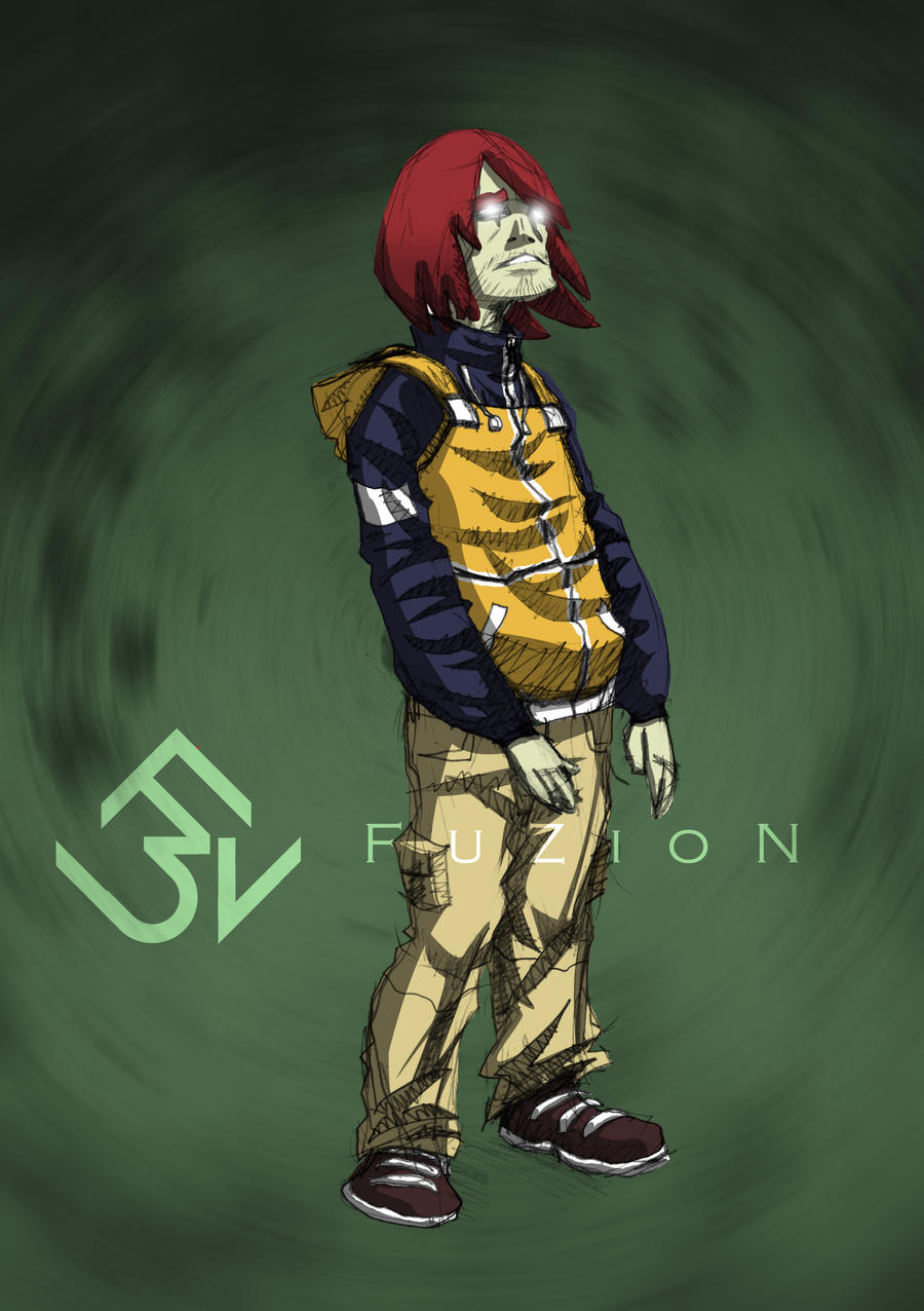
Y'know, character associations are a dangerous thing(I'm not really sure if that's the appropriate term or wording, but by character association, I mean if one character reminds you of another, for some or other reason). The other day I showed this to a friend of mine and he instantly thought the character looked like a buff Robert Freeman from Boondocks.  Ever since then, I can't see anything else, even though the colour scheme was rather arbitrarily chosen.  I originally envisioned this old as a sort of King Pin-type figure who owned a chain of notorious nightclubs... Well. There goes that image!

And that concludes this week's episode.  I'd like to mention that entry was particularly jam-packed so I could conclude the Character Design Saga and focus on other more challenging pictures (perhaps "conclude" is a bit... final.  I'll still be doing the designs, just not as intensively as I've been doing as of late).  Next time, a familiar character makes a special guest appearance and a legendary street fighter joins the line up.  Ooooh! this is getting so good!

Thursday, March 3, 2011

Lazarus Has Risen...

Y'know, I think Lararus was in on it with Jesus.  And it was all  probably some sort of a routine they took on the road.  I mean, if Jesus was a flim-flam it would explain a hell of a lot!  The entourage, the whole water-to wine-thing...  Wait. Why am I here again? Oh. That's right. It's time for yet another installment of my art prattle. Let's get straight into it, before I go off topic again. (That's the last time I open with an obscure biblical reference... So difficult to segue into art from that!)

Starting with:

I did a bunch of these after I got tired of drawing all those people.  I'd almost forgotten about my penchant for little monster-thingies.  Sometimes you gotta slow down on some of the more "serious stuff" (I put that between quotation marks because strictly speaking, none of it is really serious, but y'know...) and do a lil' doodling.  Besides: monsters are huge and integral element of the FuZioN Universe.  It's a fairly good time to get back in the swing of designing dem' critters...

Speaking of FuZioN...


"Yeah! It's ya Boi!" (What did we say bout those Jigga quotes!?)  This came about when I realised that I hadn't really done the "new TJ" in profile.  So, after a coupla drafts, this is the result.  Additionally, I should mention that I adjusted his colour palette a bit.  His skin colour was slightly off (Too much caramel, not enough coffee) and, since there are other non-white characters with different ethnicities to TJ, I had to diminish the confusion of identifying who was what a bit more than I had before (not that that sort of thing matters, but if it's part of the character's identity, then the diversity has to be apparent.  I mean, ideally I'd draw an all-beige cast to try and keep racial profiling to a minimum... not that all audiences are racist, but we're all prone to our own prejudices and... Oh my god, this hole just keeps getting deeper!). 

As you may have noticed, I switched it up a bit with the backgrounds on that last image. I got bored with my usual layout and thought it was time for a little more experimentation.  Which resulted in the image above and...


Super Fighting Robot Guy!  That may or may not be his actual name, but it's all that came to me at the time.  As I have said before, I absolutely detest design, but I have a lot of respect for those who practise the art (do you "practise" design?  Not sure. Sounds appropriate...).  Bringing order and efficiency to chaos... In a visually pleasing manner... Not an easy thing to do.  However, I can't ignore the fact that I spent the better part of THREE YEARS learning the principles (I didn't get that far though, due to my extreme hatred for it) and so I took a crack at integrating it a little into some of my art (it would also be a good exercise in improving my Photoshop skills).  Hopefully, I haven't spat in the face of all muh designer pals with this little travesty I cooked up.

To my surprise, I enjoyed this a little bit more than I expected. So much so, in fact, that I did it again.


I almost didn't colour this image as I noticed that I made quite a few rookie mistakes when pencilling this- mainly in terms of anatomical correctness and cloth physics- but there was just something about that pose! That arrogance; that swagger (the actual definition of the word)! So dynamic! And the colours were so clear in my head. It had to be done. Also, I don't know don't know why, but this character reminds me so much of Captain Marvel (the DC/ Shazam one, not the bullsh*t  Captain Mar-Vell from Marvel that no one's ever heard of and who's name Marvel won't f#king give up, preventing us from ever seeing Captain Marvel in his own self-titled series or a Captain Marvel movie!), even though the costume or the colours don't even closely resemble those of Earth's Mightiest Mortal. Must be some subliminal thing...

And that's it for now.  I'll be back real soon with more madness.  QUEUE THE CREDITS! (I've really got to come up with a more organic way of concluding these posts!)