Sunday, June 12, 2016

Not a Fan

This may be a somewhat paradoxical statement to make but these days it seems as if the only way for an individual to meaningfully contribute to mass culture (as an illustrator specifically, but I suppose it applies to other mediums as well) is to use preexisting cultural icons as a "launching pad".  There are notable exceptions of course.  But for every Steven Universe or Worm there are seemingly a thousand Divergents (ha! Wordplay...) or Teen Titans Go's  that capitalise heavily on your preexisting knowledge of characters and concepts.  And even these aforementioned exceptions seem to owe quite a bit to what came before (terms like homage and pastige are liberally thrown about when Steven Universe is mentioned; derivative when in less favourable contexts).  Before you know it, they themselves have been assimilated into the this monolithic ecosystem, there to be similarly emulated.  I'm not just taking postmodernism here (I don't think) but the marginalisation of the creative process as a whole within the paradigm commercial viability.


What I'm leading up to with all that drivel is this.  I don't think it's much of a coincidence that this is by a great margin, my most popular drawing on Deviantart. It's an alright drawing I guess, but I definitely have stuff that I consider to be superior.  It was my real attempt first attempt to tell a whole story in a single panel.  I've always loved those promotional drawings that sometimes accompany a manga chapter.  I mean, it's usually just the characters at a beach or eating sushi or something, but you also get some really creative ones.  Anyway, I did this mainly emulating that and it became super popular (relatively speaking) and I think for better or for worse fed into the pursuit of that same success through similar ideas.


This, considerably less successful, probably due to the maturity filter I added, came about as a result.  It's something I'd always wanted to do, but I also think it was fast tracked in the way it was due to it's potential for likes and comments.  It's also reflective of my growing tension towards this line of artistic reasoning as it's less fanart, and more of a "what if?".


Further down this avenue is this.  This was done on an A3 page and was sort of when I first really committed to using french curves again.  Not as easy as I assumed and anyone who cares to look closer at it will notice quite a high number of mistakes and overall unpleasant bleediness.  At any rate, on fan forums, as some might know, Sasuke and Itachi are commonly referred to as the Uchiha Bros.  I'm not really sure if it's specifically supposed to reference the Mario Brothers but I just kind of ran with the idea (It's actually funny how many parallels one can find between the two sets of brothers, especially if one has played the Mario and Luigi RPGs).

Wow! 2012!


This felt more more acceptable to pursue, as it wasn't just interpretations of preexisting characters but a kind of deconstruction of multiple characters with what were essentially "new"  characters ( as postmodern as it gets).  A world where jutsus and chakra are kept in floating golden question mark cubes technically hasn't existed before.  Same goes for Mariachi and Sasuigi.  Still, that the above are no where near as well-received as the relatively straightforward Street Fighter example kind of proves my point (or it could just be that their not as good or as clever as I think).


About late last year, I did these sketches,which are of Batman characters reimagined as characters from Jojo's Bizarre Adventure.  I toyed around with it a bit since then, adding Hirohiko Araki's influence to varying degrees but it never quite gathered steam. It's a fun and silly idea, but I get kind of bummed out at the thought that no one is interested in seeing any of this and that they'd rather I draw another bloody picture of Heath Ledger.  I could spend the whole day thinking up a design and attacks for Platinum Bat (Bruce Wayne's stand, obviously) but people would still rather see a genderswapped Disney drawing from Sakimichan (Not to take anything away from her and the success she's enjoyed.  She's obviously very good and puts plenty of time and effort into her drawings but it's not the most stimulating of content).

I mostly just frustrated I guess. This negotiation of "fanart space" I'm undergoing seems to be the only way I can move forward and reach people while still maintaining some creative integrity.   Fanart's enjoyable but it's a little disheartening that the most popular independent artists make most of they're money from copying other works.  It's even more disheartening that this is what people seem to want.

Saturday, June 27, 2015

Non-Sequential

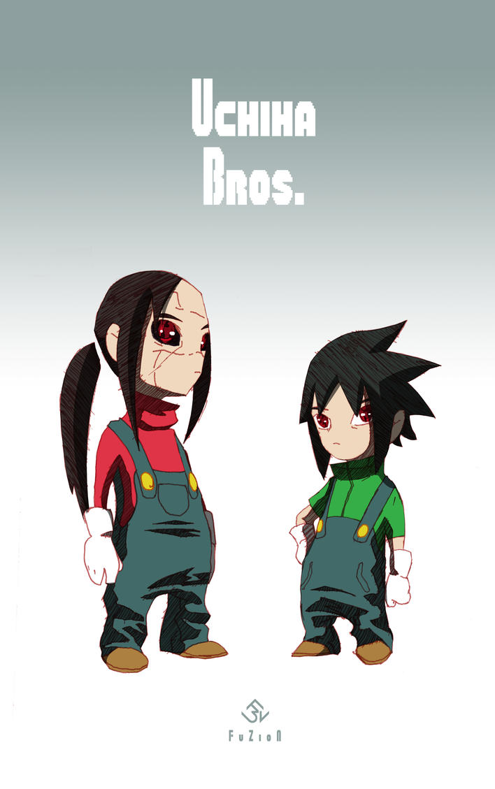
Before my very long hiatus from here, I’d mostly been trying to keep my blog posts chronologically in line with when the art was made.  But with my notably unceremonious return has come a newfound appreciation of social media’s inherent ability to distort space and time and lend a kind of poetry to life where there might initially not have been any.  Even throughout my initial run on the blog I quickly fell months behind what I was posting on My DeviantArt page, which in turn was behind what I had completed on my PC, which in turn was naturally a couple of weeks behind everything I was sketching.  This resulted in multiple increasingly warped artistic timelines, which, as none of them were truly indicative of my development, served only to expose the artificiality of representation on the internet (or just representation in general, I suppose).  As such, my selection of what to exhibit from when is dictated largely by what would make an interesting post rather than what order the images were made in.   This idea, I think, is quite nicely mirrored by the distance between a finished piece of work and the time of its conception.  Sometimes you have an idea, induced by fever dreams or phantom trains of thought, that no matter how nonsensical or seemingly insignificant you feel you have to see it realised in some concrete form or another.    But once you commit to this process of realisation, the work sometimes becomes increasingly divorced from the feeling that propelled it to being.  You take multiple breaks – you have a meal, you go see a movie, or you forget about it for a few weeks – and it eventually takes on a mechanical quality that seems to linger until completion.  Further compounding this temporal phenomenon is the hypothetical viewer, who looks over the creation from some indeterminate future in a matter of minutes (or seconds), hopefully laughs or frowns in all the appropriate places, and promptly forgets about it.  The whole thing would be absurd if it wasn’t so integral to art in its entirety.

Called it "Wild Shift in a Tone...ment". 'Cause puns are never uncalled for.


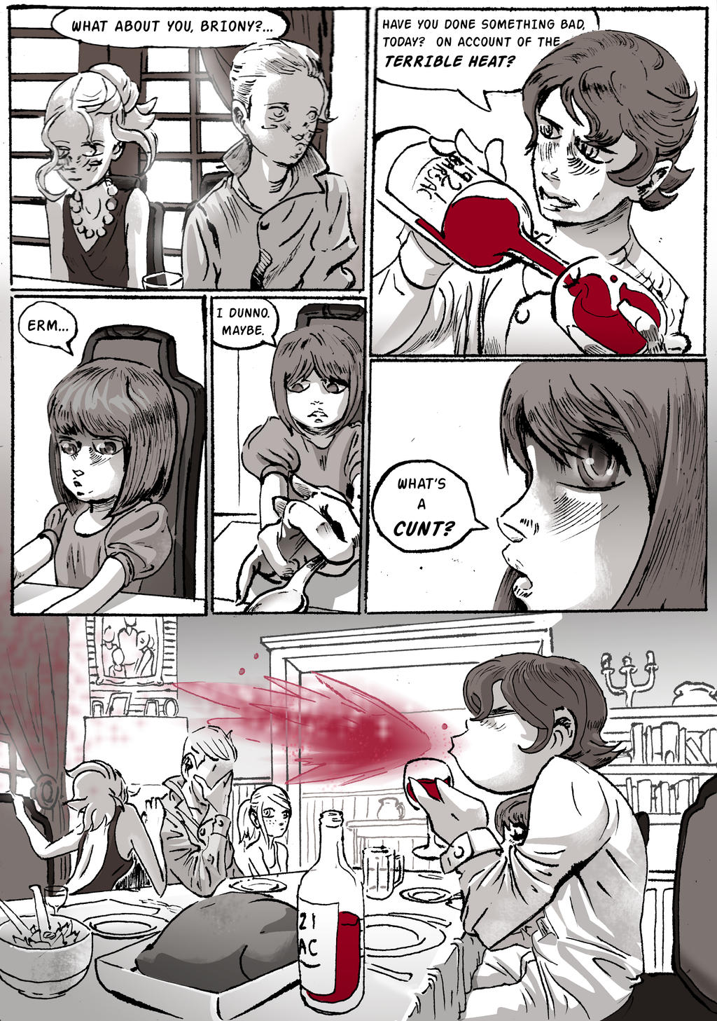
Speaking of inconsequential ideas, this was... fan art, I guess you could call it, of the Ian McEwan (that CANNOT be his real name) novel Atonement.  While I haven’t seen the movie, I can guess that it would still have this scene in it, or something similar, so that the reference isn’t completely lost to watched rather than read.  Without giving away any spoilers, this pivotal scene presented the main characters the last opportunity for a little clarification before everything went to hell (for no real reason, I might add, but that’s beside the point).  One question about a certain C-word would have solved pretty much all the conflicts in the book and would have prevented an entire generation’s destinies from being determined by a little sexual immaturity.  Anyway, I don’t know what possessed me to even do this but I completed the line work in little over a day, largely in one sitting (again, I have no idea) and I think I did the colouring/ shading the next week.  From what I can remember, looking at it now, I was eager to try some of Atsushi Ohkubo’s colouring/shading techniques (it’s pretty much greyscale so I don’t know what I’d call it but the process functioned largely the same way as colouring did).   I had also finally gotten round to reading the Soul Eater Manga and I remember that at a certain point (Arachnophobia Arc) the artwork took a huge jump in quality and I guess I couldn’t wait to imitate some of what I saw.


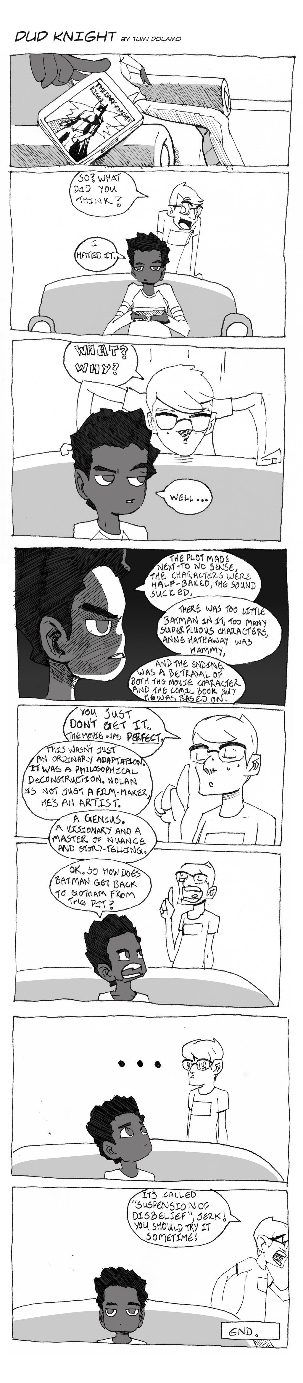
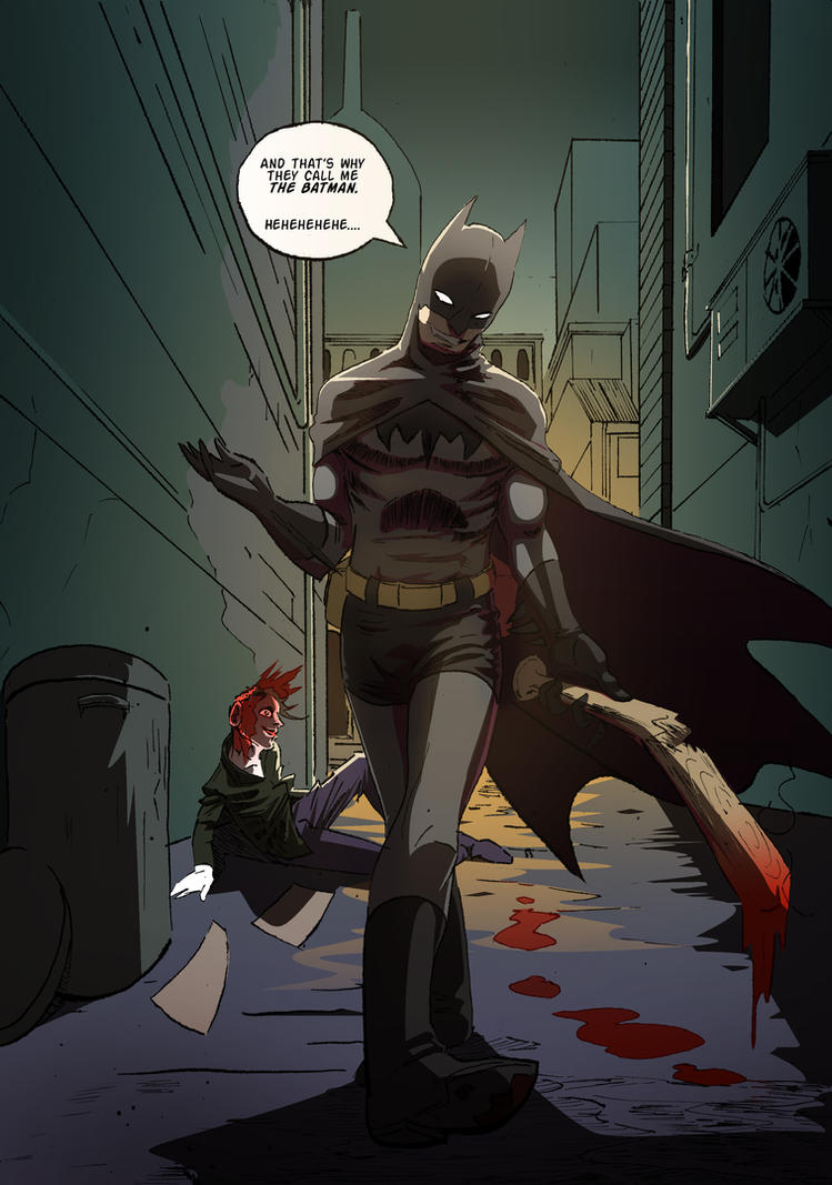
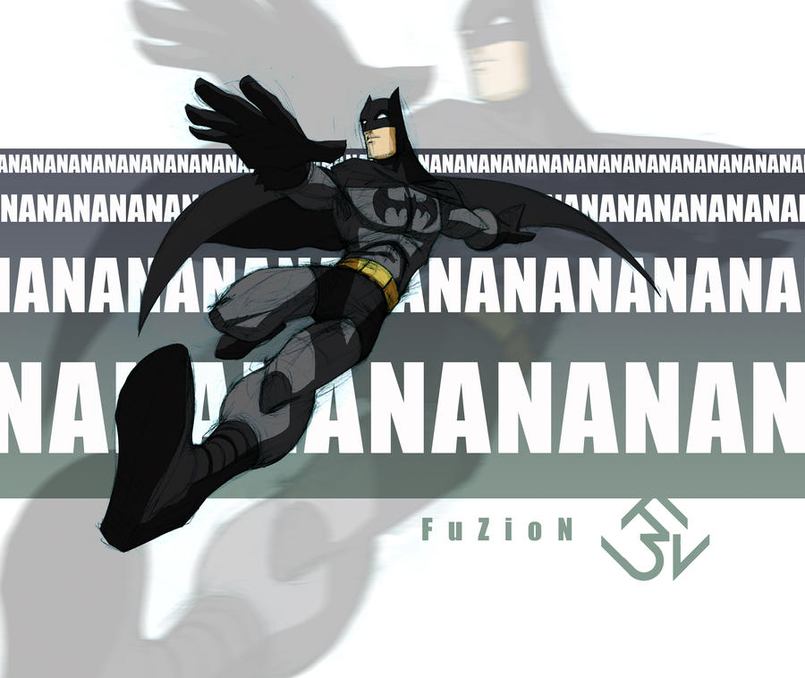
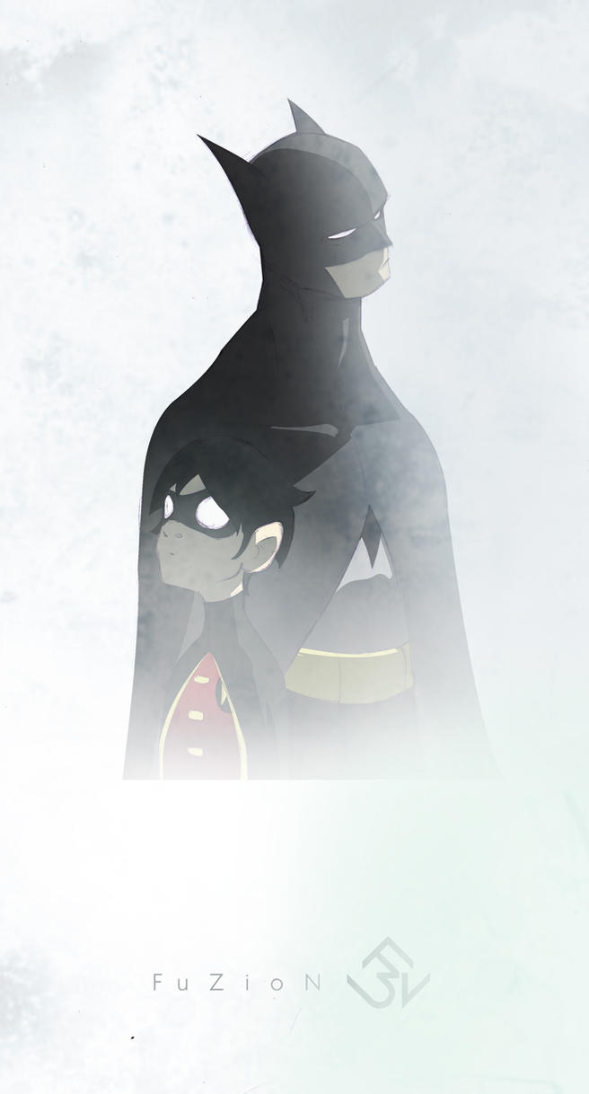
On the other end of the spectrum (in a number of ways) is this entry, which I did with a very specific and unambiguous motivation in mind.  It’s not that funny or that visually impressive, but I think it served its purpose well enough, which was to voice my opinion on the last Batman film by Nolan.  This was my first attempt, I think, at doing a short comic (with the intention of it being seen by others) and there was a lot learnt about the amount of forethought that can and ought to go into this sort of thing.  Also, using nibs is HARD.


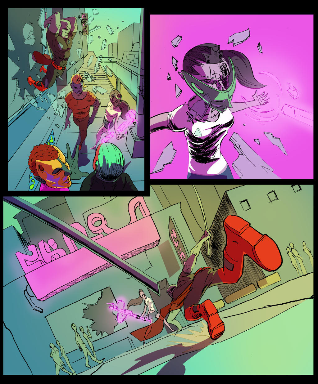
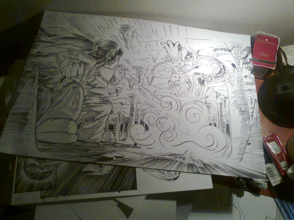
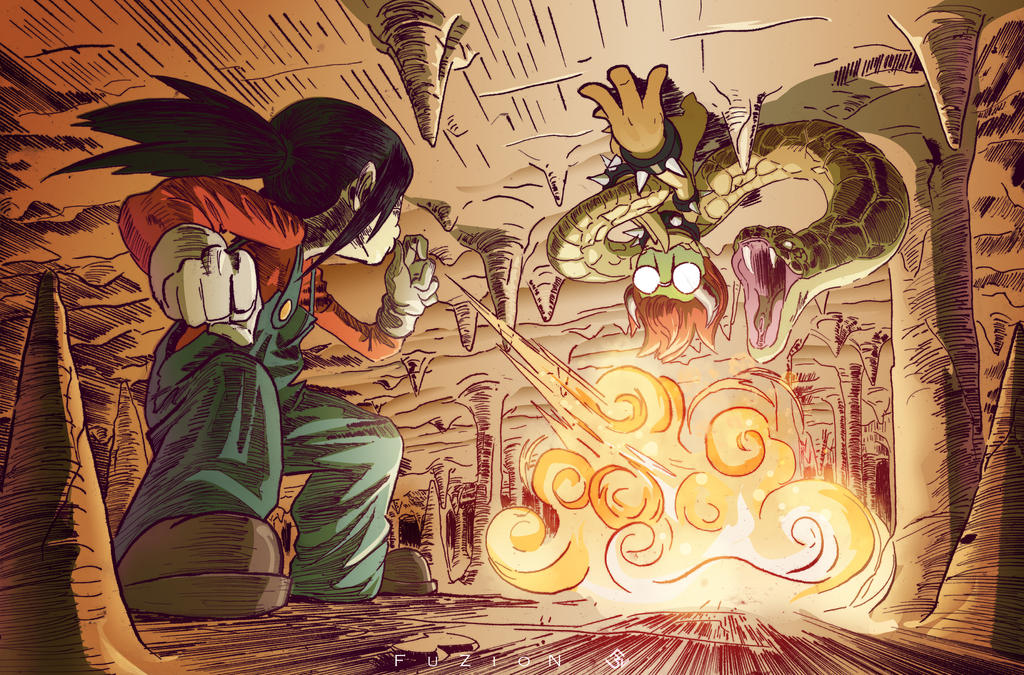
I had a dream, once.  Well I‘ve have many dreams at many different times but this one seemed particularly well-suited to turn into a comic.  That never happened though as, apart from my laziness and my ADD addled mind, I discovered that a pretty much identical idea had been much better used by someone else (damn you, Naoshi Komi).  But I did get around to sketching some of what I dreamt (and I even wrote two very short chapters about it) and thought it was all interesting enough (or at least worthwhile from an experiential point of view) to arrange them in a short sequence and colour them.  I don’t know if I managed to capture the frantic surreality of the dream but I’m glad that there’s at least some correlation to it from my end.


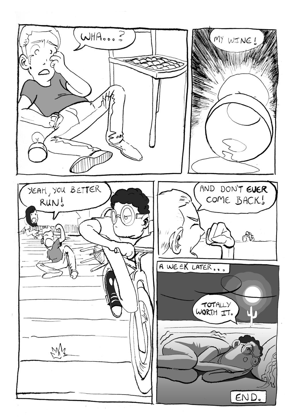
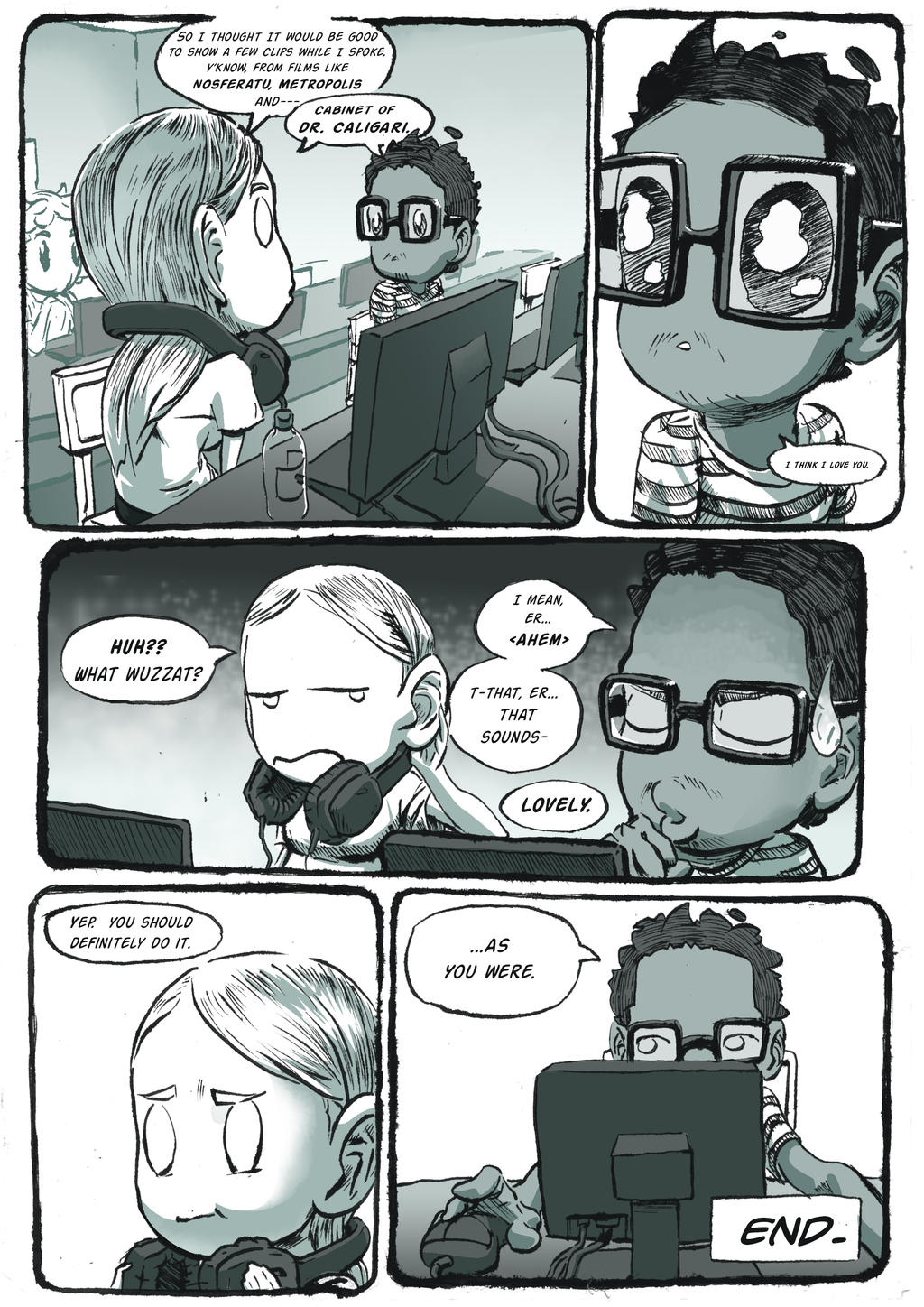
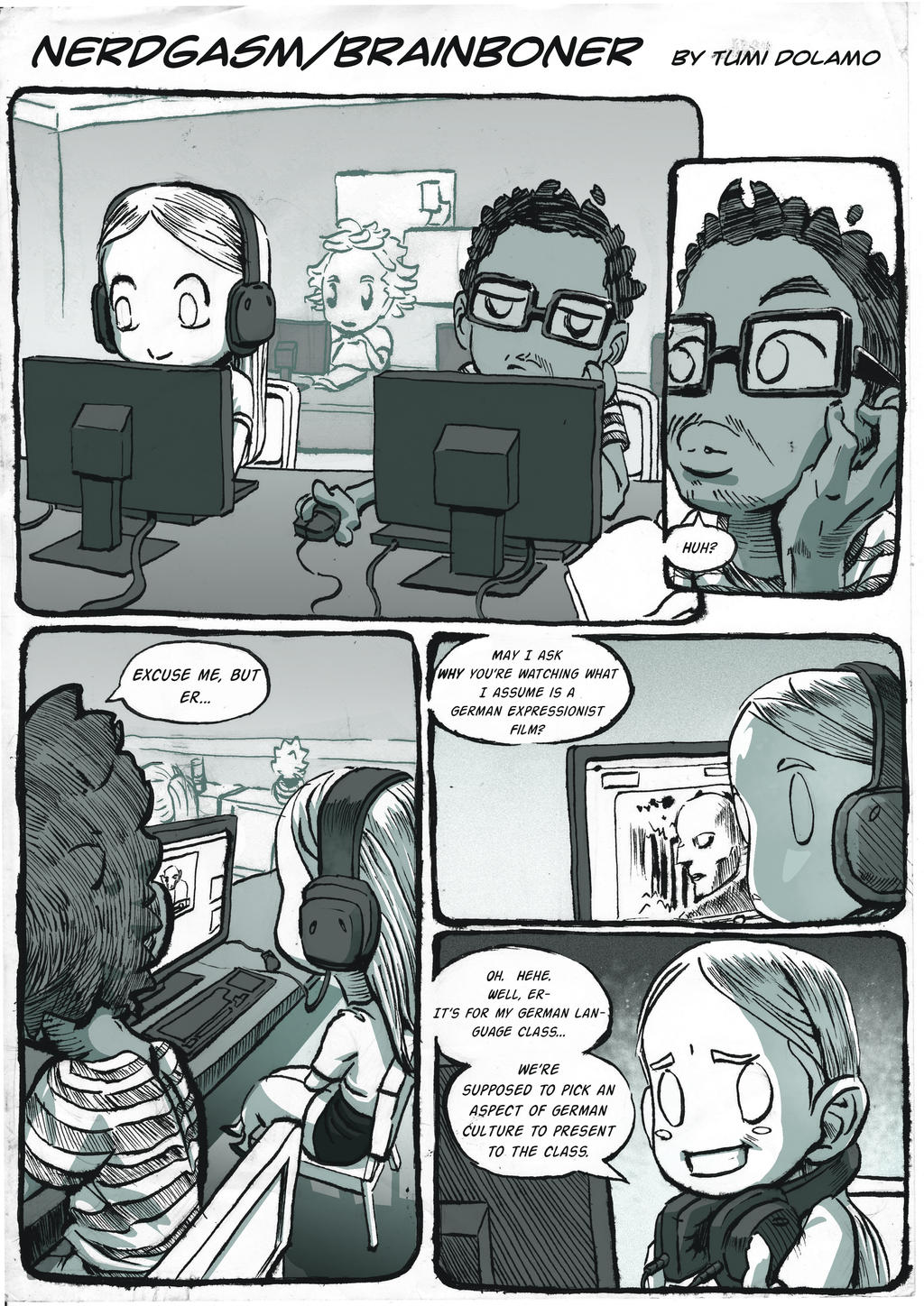
This was sparked by a combination of my disillusionment with academia (I think learning is very important and I take it seriously but I don’t think educational institutions are necessarily representative of that) and a very strange conversation I had with my nephew.  I was getting a bit more experimental with the whole short comic thing but I don’t think I’d committed to pushing it yet (i.e. not reflective of my skill but more my attitude towards the intentions of the thing).  Now that I think about it, it’s actually way more allegorical than I thought ...


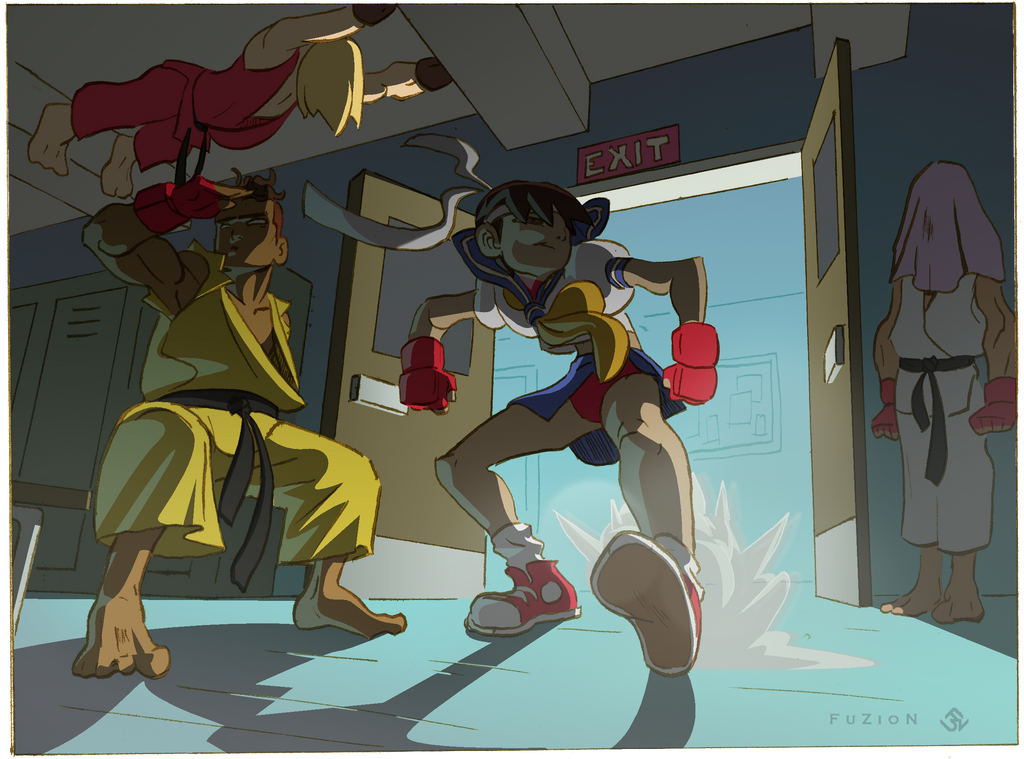
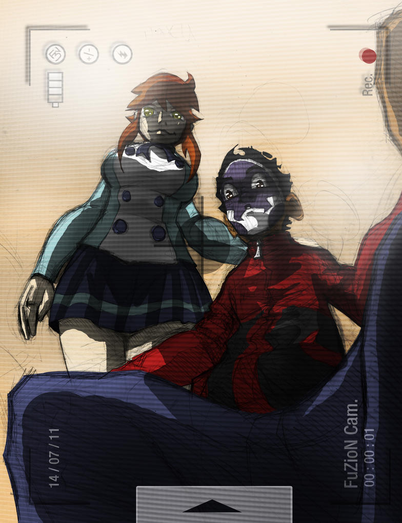
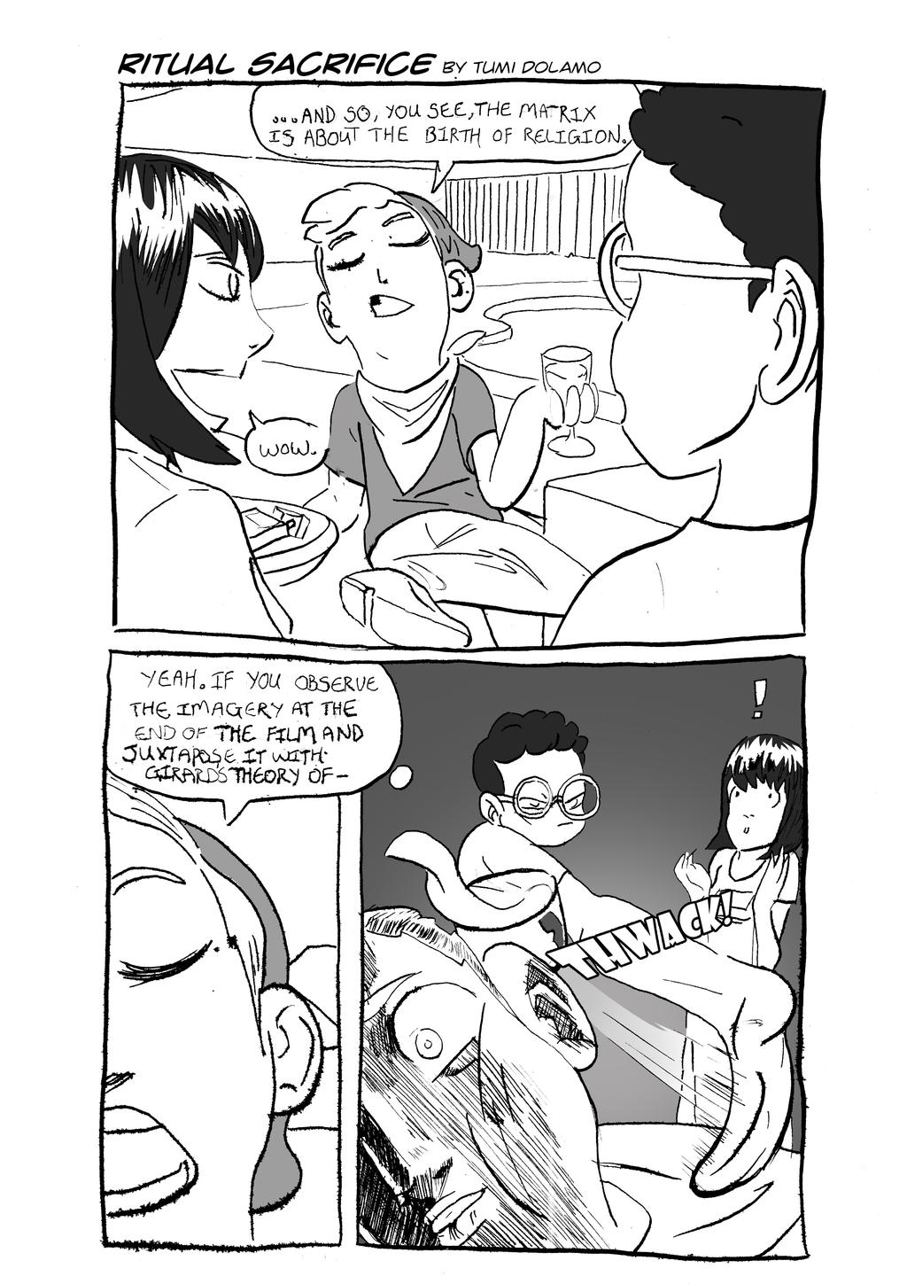
Lastly (I mean, there are more comic-related examples but none carrying the same thematic resonance as these), is the most bizarre example one here.  I probably put the most effort into this than anything else on here.  Like the Atonement comic, it’s probably not funny enough to justify how long it took, but it does reflect my current attitude towards the entire concept of short comics (and art in general).  Anecdotally, there were so many coincidences that occurred around this thing that it’s hard to put all into a satisfactory summary but to put it briefly: I improbably got to know the person featured in this comic a little better later on, which transformed the entire tone of the whole thing when later viewed by mutual friends.  But they (the real life occurrences surrounding the creation of the strip), however, are heavily emblematic of the artificiality and temporal compression found in the act of presentation.  Even the comic itself, mostly for the sake of narrative clarity and ease of execution, rearranges a few elements of the “real life” events that comprise its subject matter.


My point, if there even is one (beyond a pitiful attempt to validate my existence), is that reality as constructed through something as heavily mediated as social media is incredibly flexible.  Much in the same way that comic books function, an entirely synthetic narrative, whether consciously or not, can be constructed from a few well-placed posts.  The document of artistic development can be rooted a year in the past (or traverse that amount of time in a day) and a quick reflection on a surprisingly awesome encounter can become the confession of a secret love after months of fermentation.  It’s all distorted in some way anyway, so one might as well go for the more interesting option.  The presentation thus (yes, thus) serves to accentuate its own content and we enter a whole level of “meta”.  It’s an interesting exercise and I hope you’ll stick around to see where it goes.

Tuesday, June 16, 2015

"Just the Same But Brand New"

Because I like St. Vincent, that’s why.  But also, because I think it’s reflective of this ambiguous sense of stasis and that surrounds any aspiring artist’s work in many ways.  It’s something you try to overcome, through improving your technique or through complexity in your work but it’s also something that’s difficult to abandon, as it’s somehow become all you know.  Of course, it does sometimes seem, when you look back at your work, both old and new, as if countless generations and ages have passed by; as if entire worlds were opened and then collapsed over the intervals between finished works.  You look at a similar aspect of two different drawings and you think how radically your approach to it has altered. But despite these leaps you believe you’ve made, something has endured.  For better or worse, there is a lingering, seemingly inescapable contiguity between the images.  It’s also just a nice title.  And yes.  This is how I talk now.


This is part of an unofficial series of illustrations I did in order to test various colouring techniques (I have yet to acquire a tablet and I’m still searching for ways to make the process more efficient and appealing), perspective concepts, character proportions and character design.  I learnt I still have plenty to learn (obviously) but I also learnt a lot while doing it.  There’s no real context for this stuff (I titled this Alien Escapee in Photoshop but it could just as easily be a bounty hunter or... a freedom fighter) other than the vaguest of details.


Also from that same “series”.  I'm reluctant to use that word because it maybe suggests more intentionality than there actually was.  I just happened to draw these ‘round about the same time with similar compositions.  This must’ve been the first one I sketched, though, ‘cause things noticeably more “wonky” than the other one. These were all sketched and then later inked freehand.  I should point out, however, that they were not done in the exact order they were conceived.  So while I may have sketched this first, the inking and colouring were likely done after the first one.  Either way, there’s some stuff on here which I really worked well , but also some stuff which didn’t work so well, but which led to some interesting solutions later on.

Probably my favourite from the series (screw it, you know what I mean), if only because of the lighting.  It’s not perfect, I mean those shadows on the bridge should reach a lot further off frame judging by how they hit her thigh, but whatevs.  It may just be because it’s more “Naruto-ish” than the rest (I called it Travelling Sage) but I really like the design and, of all the works presented here, I would probably choose to develop this as a concept, though I know not for what.  Also, that “blur” on the right isn’t an effect or anything.  It’s just the opacity of the layers and the particular mix of colours converging the way they did.  Just a freak accident really.

Although the Travelling Sage image is my personal favourite, I think this one probably came out looking the best.  There’s an effective simplicity, about the colouring especially, which I’ve been pursuing pretty much ever since.  Every time I look at this picture though, I can’t help but think how impractical that outfit is for... whatever it is that she is.  Thief, assassin, performing acrobat... whatever her profession, that outfit would hinder her in some way.  Looks cool, though.


I’m not sure how this ranks, as far as comebacks go.  I know it's not Robert Downey Jr. levels, but at least I’m no Jay-Z (anyone who’s bothered to read my older entries would know why that’s especially funny, not that I’d advise as much).  I stopped for a number of reasons, mostly because I didn’t think anyone cared, but I’ve returned to blogging mostly as a means of holding myself accountable for my art related activities (or lack thereof).  I need some concrete document that I’m actually moving towards something and not just imagining that I am.  And hopefully that will feed into the process and propel me even faster towards whatever that may be, with increased clarity. If not, I can at least work on my self-indulgent, pretentious prose.  Now that the people in the streets have long overtaken me, this impression of weightlessness no longer feels like it’s enough. (Annie Clark, I’m sorry if I’ve butchered the meaning of your lyrics).

Saturday, September 29, 2012

A Steaming Pile

I was originally going to make a TS Eliot  "Waste Land" reference (since that god forsaken poem's monopolised my entire head-space over the course of the week) but this title seamed like a more apt, lowbrow substitute, I think.  Much like the poem, though, we're going to traverse the debris of my efforts at creativity and contemplate the nature of the imminent rebirth.  Is there hope for a fertile future or has this arid terrain doomed me to sterility?

... And on that cheerful note, I present the Beast of the Apocalypse:

How on Earth did he get that wife-beater on??

Hellboy is, by a considerable margin, my favourite Superhero of all time, if I can even call him that.  What Mignola does with pulp literature, Gothic poetry, and a wide array of supernatural folklore and classic mythology sources,all on the pages of a comic book, is nothing short of genius. Which is why it's so odd that it's taken me so long to draw draw him (I done fanart of Tess Mercer for godsake!). The accompanying text is a quote from Nick Cave's Red Right Hand, which is such a perfect fit for Hellboy (I still remember buggin' out when it played in the movie) even though the song itself is completely unrelated to Hellboy. Interestingly enough, the whole Red Right Hand thing originally comes from John Milton's Paradise Lost (deep with the epic poetry today!) and refers to the exact opposite of both the figure in the song  and Hellboy.  Overall, I was happy with my tanktop-wearing interpretation of Hellboy (I've since seen much room for improvement), which marked  a significant step forward in my colouring techniques and from-building.


From one apocalyptic beast to two others:  These guys are the Twin Angels previously known as Toku and Rykou (Those names are soon to be changed). They are the two main characters of a series I once called Absolute Power (The title is also Subject to change... Did I mention I was 13 when I thought this up? Back then, I got really deep into Angeology and Demonology. I was also really into Shounen Anime. And Metal Gear. The end result of all those passions eventually turned into a series known as "Absolute Power"). They find themselves on opposite sides of a war that'll determine the fate of humanity. They are also the key to the war's end, as they are both the hosts of an apocalyptic power known as the Toren Beast (that I'm keeping). Their designs were vaguely inspired by Solid and Liquid from the Metal Gear Solid series (which would be more apparent if I'd presented full-body pics, but...), another all-time favourite of mine. 


These guys, or two of them at least, were shown on my very first "exhibition".  From left to right we have Joe, Raziel and Malik. Raziel and Malik are the half-breed sons of twin Angels (sort of), making them Gregori (Hence the title) while Joe is regular human (Ha! A Regular Joe, amiright!) with a supersuit.  The three of them are the main characters of second half of the story, which I hope to at least take a quick look at again some time soon.  As you can probably tell, if you cared to look closer, these last two drawings are a lot older than most on this, employing my older style. They are of the last that I did from this soon-to-be-renamed series. 


And speaking of chain-smoking, Gravelly-voiced one-man-army super clones...  here are my first Solid Snake attempts. The drawings, which I immensely enjoyed colouring, were just from a bunch of sketches I did when I should've been studying.  I just liked how they came out (despite questionable anatomy in some areas) so I ran with it (or them).  Hopefully I'll get to doing a Snake a Solid (when you're on fire, you're on fire!) one of these days.

So what can one glean from this coalescence of epochs that now lays before us, soon to join a forgotten pocket in the flow of time?  I can not begin to guess what the answer may be for anyone who reads this, but for me, there are awaits a hope for improvement. Room to build on what's come before.  And, like the viaduct resembling a bird of doom in the aforementioned Nick Cave song, a looming countenance of despair. 

That wasn't pretentious at all.

Saturday, September 8, 2012

Friend of Friend

Al right.  So I won't even bother with any introductions.  As far as introductions go, I would say may skills range from competent to tragic, which largely means they never really dazzle (And honestly, they only ever  meander around the vicinities of apologetic and self-indulgent).  As such, the prudent thing would be to skip them, I think.  I have some time.  I have some art to show.  Let's do it(D'oh! How was that for an introduction?).


One of the curses of being an artist (or an aspiring artist, rather) is that you are inevitably asked by friends and relatives to draw things for them.  And while it never occurs to them that drawing is as much work as balancing a ledger is, you're always obliged to do it.  Sometimes begrudgingly, but you do it.  In this particular instance, I was relentlessly hounded by one of my good friends for well over a year. And after much dragging and procrastination, I eventually got around to it, using it as an opportunity to try and emulate something I'd seen on Rad Sechrist's Blog.  I was pleasantly surprised by how much I enjoyed myself.  So much so, in fact, that I soon followed with this:

Not only was I glad to do these, but I was glad that they were glad when they saw them.

Sometimes though, you're friends' creations inspire you to draw something for them.This character is the protagonist of an upcoming comic book series known as Soul Heir which will be, if I'm not mistaken, written and illustrated by THIS GUYI honestly don't know that much about plot details and such (post apocalyptic type setting with an "Assassin's Creed meets Jak 3" type feel from what I can tell) but Haki over here looks pretty badass and I couldn't help doing some fan art. I took a few liberties with the costume but I tried to stay as true to the spirit of the character as I could.  Look out for Soul Heir this December.


Some fans need to calm down...

And every so often, I dabble in social commentary.  I drew this a while ago when I'd first heard about the DC Reboot and the protests that were going around. For the record, I'm not happy about the reboot either, but I just thought the reaction and some of the things that were being said at the time were a bit over the top, and it resulted in this little satirical (and hopefully humerous) piece. Weird how my mind works sometimes. I would do a lot more of these but, sadly, I'm not that funny (that I had to explain this a number of times to a number of people should be proof enough).

I should stop there.  While I'm still not posting as frequently as I'd like, I think it's somewhat commendable that I managed to beat the very neat five-month gap that separated the last two entries.  Catch you on the flippidy-flip.


Tuesday, August 7, 2012

"Like the Sundance Kid Behind a Synthesizer..."

Because I love quoting Arctic Monkeys, that's why.  Yes, it's been quite a while.  In fact I think this is only my second post for the year! And what a year it's been.  Once again I would like to take the time to assure you (and once again I hope you take me on my word)  that's these hands have not been idle.  At the very least, they've taken to the task of  tearing my hair out (quite literally in a lot of cases) while trying to construct functioning universes, polishing my style and storytelling abilities and working to develop the best possible products for impending deadlines.  Overall, sharpening my skills as a creative  individual.  While there's really no excuse for my infrequency, I hope this batch of drawings will begin to make up for it and perhaps prompt me to become more regular (Ha!).


What's this?  Why it's TJ and his good friend Haku, who hails from another dimension! This is just a bit of Pseudo fan-art I did featuring TJ and Deviantart friend's character Haku.  At this point, I was really starting to get conceptual with the illustrations I made and made an active effort to place what I drew in some kind of context.  Don't ask me why TJ has his face painted like that, but what I do know is that the design he has also doubles as a clue to one of the many aspects of the FuZioN U.  Yes, that aspect does involve cute little monsters.

And speaking of Fan  art:


Yeah!  I did some Batman fan art.  Mainly because...  Well, why not?   I hadn't ever really drawn Batman before but I quickly came to some understanding of why so many other people had.  Weezy is awesome to draw!


Yeah, It wasn't long before I was on to the next one.  Aside from the "weird-factor" of a single billionaire spending all his time with a thirteen-year-old, there was always something very cute about The Batman and Robin dynamic, especially when it came to Bruce and Dick. And the Batman Universe in general (an aspect which, as much as Nolan and other fanboys may vehemently deny, is intrinsic to the character).  Anyway, I tried to bear that in mind when pencilling these images and for the most part, I think they reflect that.


This next piece of fan art (which, in case you hadn't already guessed, is the theme for my latest entry) was just a sketch I had lying around that I decided to colour one afternoon (or was it evening?).  Very few can match the badassery that this man exudes.  I hope I did him justice.


And one last one before I go.  I know I JUST said that the theme was fan art, but I think I'll make an exception for this piece (think it ties up with the emphasis on context thing I was talking about earlier, anyway).  I had a little fun with creating a faux-pulp comic cover for a a random picture of a few characters I had lying around (hence: "Randomites".  How do I come up with this stuff?!)  Not only was this a challenge to push my drawing style (you may not be able to tell, but there's a lot of "perspective-y" stuff I tried out), but it also posed compositional and palette challenges (design lingo out the window!) that got me into expanding the scope of my images beyond just character design.

If there's an overarching theme to this blog post (apart from fan art), it would be growth.  I suppose you could say the same for my entire blog, but I just feel that this selection of images particularly represent turning points for me as an artist, which line up quite nicely with where I am right now.  Sometimes, as you improve, what follows your sense of accomplishment, is an overwhelming feeling of self-doubt and it almost starts to feel as if you get worse.  As you move on to a higher tier of expertise and clarity, the expectations you have for yourself move doubly so.  I have reached so many lows this year that I sometimes think giving up might be the wise thing to do.  There's nothing worse than being average among excellence, if that makes any sense.  But then occasionally, one stumbles onto a development- be it a better understanding of anatomy, or a clever design, or a solution to a plot hole, or whatever-  that reinvigorates that impetus to the point that it near consumes you, and letting go essentially means death...

Or something like that.

Thursday, March 8, 2012

And Now Back to Your Regularly Scheduled Programming

Because it's been a while, that's why. This is my first blog of the year, and I think it'd be prudent to get all the admin out the way.  First and foremost, I'd like to reassure everyone that I'm still alive.  Rumours of my demise have been greatly exaggerated. Secondly, I'd like to thank all (three?) of my new followers and also apologise for having nothing to offer until now.  Despite what my last entry may have suggest, my juggling skills are currently far from masterful, and I've found that I've often had to sacrifice a few things - this blog,unfortunaltey, being one of them for all of December and January - in order to get some of the more pressing tasks done.  I've still got tons on my plate but I think it's way overdue that I make time for this much neglected blog.  But, that's neither here nor there, I suppose. What is here, or what should be here, is my collection of pictures, which I'm about to get to.


Starting with this cutie. I remember promising that we'd be delving back into that mystic nook known as the FuZioN Universe, and sure enough, here we are, kicking it off with one of it's main characters, who has taken an astonishingly long time to make an appearance.  I give yiou Ms. Katrina Summers.  She'll be TJ's foil and eventual kind-of-love-interest.  I know she looks like a bit of a cliche(Attractive blonde as the leading lady is so 90s) but hopefully her personality will make up for it. I assure you, she has quite the personality.

That being said, this isn't her final appearance, but was the the first batch of drawings that showed me the way to go. Her final appearance looks closer to the person she was based on and less... "Depro" (which was the sort of vibe I got from these sketches).


See what I mean?  This is her in her much perkier, more streamlined final appearance.   I also feel this version really allows much more consistency as far, as far as drawing the character goes. Yeah, I know it's just head-shots but that's what I was focusing on at the time.  And yes, the two at the bottom have a slightly different hairstyle/head shape, but the face model had already been established at this point so I didn't think it was that big a deal (plus those two just have so much attitude!)


And this is Lisa Bleu(originally spelt "Blue"...But then I took up French), yet another member of H.A.W.K.E Industries.  I'm not sure what was going through my head when I drew the first Lisa and Katrina concepts but these characters looked way too morose for my liking afterwards.  Her current design(which I've yet to colour) is slightly cheerier, but the badass 'tude is all left intact(I think).  I think  I'll keep the characters details to myself for now.


And last but not least by a long shot, we have Champion of the FuZioN U himself, TJ!  Over my one-and-a-half years of Photoshopping, I've really grown to love doing is messing around with textures.  Especially grungy ones.  But ironically enough, I hardly ever get to use them.  This picture represents one of those moments when I could finally let loose and (tastefully) go crazy with applying some chaotic grunge.One thing I always ask myself when looking at this picture, though, is what could possibly be happening in this moment that TJ would need to stand like that?  Seriously!  Although I suppose it's not half as random as...


This last number. Yes, last. And inspite of it's randomness, I really enjoyed cooking up some poses for Chibi TJ.  Maybe a Gaiden of Chibi TJ shorts might be in order?

Hope this tepid return wasn't a disappointment to all those eagerly in waiting(because we all know how sought after my thoughts are).  I'd like to think the drawings will help make up for my being less than forthcoming with the FuZioN U goings on.  I don't know if I've mentioned this beore, but after reading Nicholas Cole's blog, I've decided become a lot more calculating about what sort of info should and should not be given out.  It's nice to get readers involved and divulge the inner workings of characters and their motivations and roles, but you really don't want to pull the curtain too far back and reveal too much.  Some of the mystery still needs to be retained even if that means keeping aloof at times.  So I guess this is me trying to find the balance. Bare with me.